
ActivityCalendar, Sankey and Funnel Are Now Available in Mercury
Data is not always best presented as a table or a bar chart. Sometimes you want to see when something happened. Sometimes you want to understand how categories are connected. And sometimes the interesting question is how quickly a large group becomes very small after applying a few conditions.
We added three new output widgets to Mercury for exactly these cases:
- ActivityCalendar — visualize activity over days, GitHub-style.
- Sankey — visualize flows and relationships between categories.
- Funnel — visualize how values change through an ordered sequence of stages.
All three can be created directly from Python in a Jupyter Notebook. More importantly, they can be combined with Mercury input widgets to turn a static visualization into an interactive web application.
Instead of demonstrating them only with artificial datasets, we built three applications with real-world data.
ActivityCalendar: see years of activity one day at a time
GitHub's contribution calendar is a remarkably effective visualization.
A year contains hundreds of data points, but instead of showing a long time-series chart, every day gets a small square. Color intensity makes periods of high activity immediately visible.
The new ActivityCalendar widget brings this type of visualization to Mercury.
import mercury as mr

mr.ActivityCalendar(
    daily,
    date="date",
    value="value",
    title="GitHub incidents starting each day",
    unit="incidents",
    color="green",
)
The widget expects one numeric value per day. Missing days are displayed as inactive squares, while positive values are represented with different color intensities. A date range spanning multiple years is automatically displayed as a separate calendar for each year.
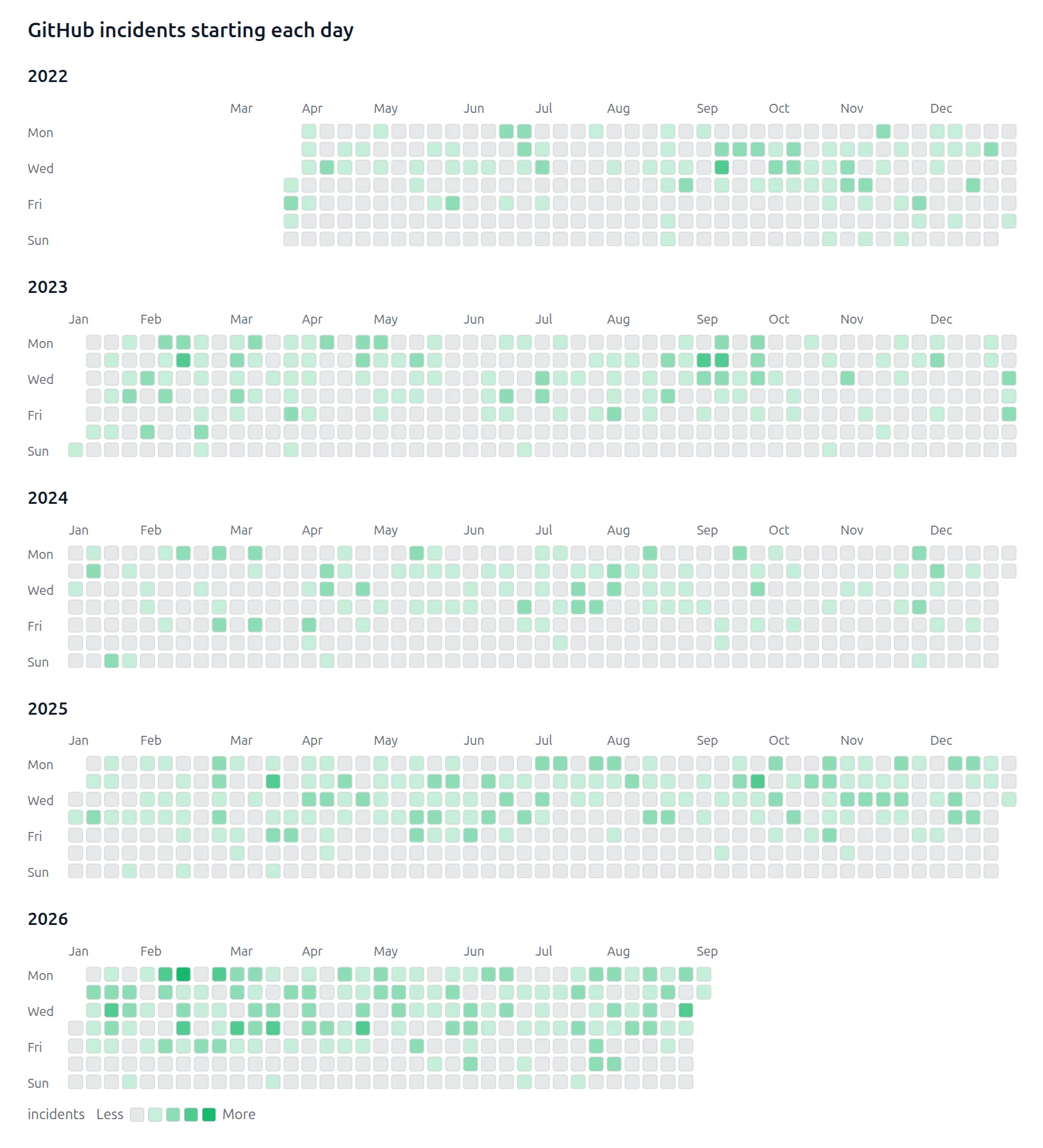
We visualized GitHub outages with GitHub's own calendar
For the first real-world example, we thought GitHub was a particularly appropriate dataset. We collected GitHub incident data and aggregated incidents by the day on which they started. The result is a GitHub-style calendar showing GitHub incidents.
So, essentially:
GitHub incidents visualized using GitHub's own contribution-calendar design.
Looking at several years at once makes patterns that are difficult to see in a normal incident table much easier to notice. But the calendar itself is only the beginning.
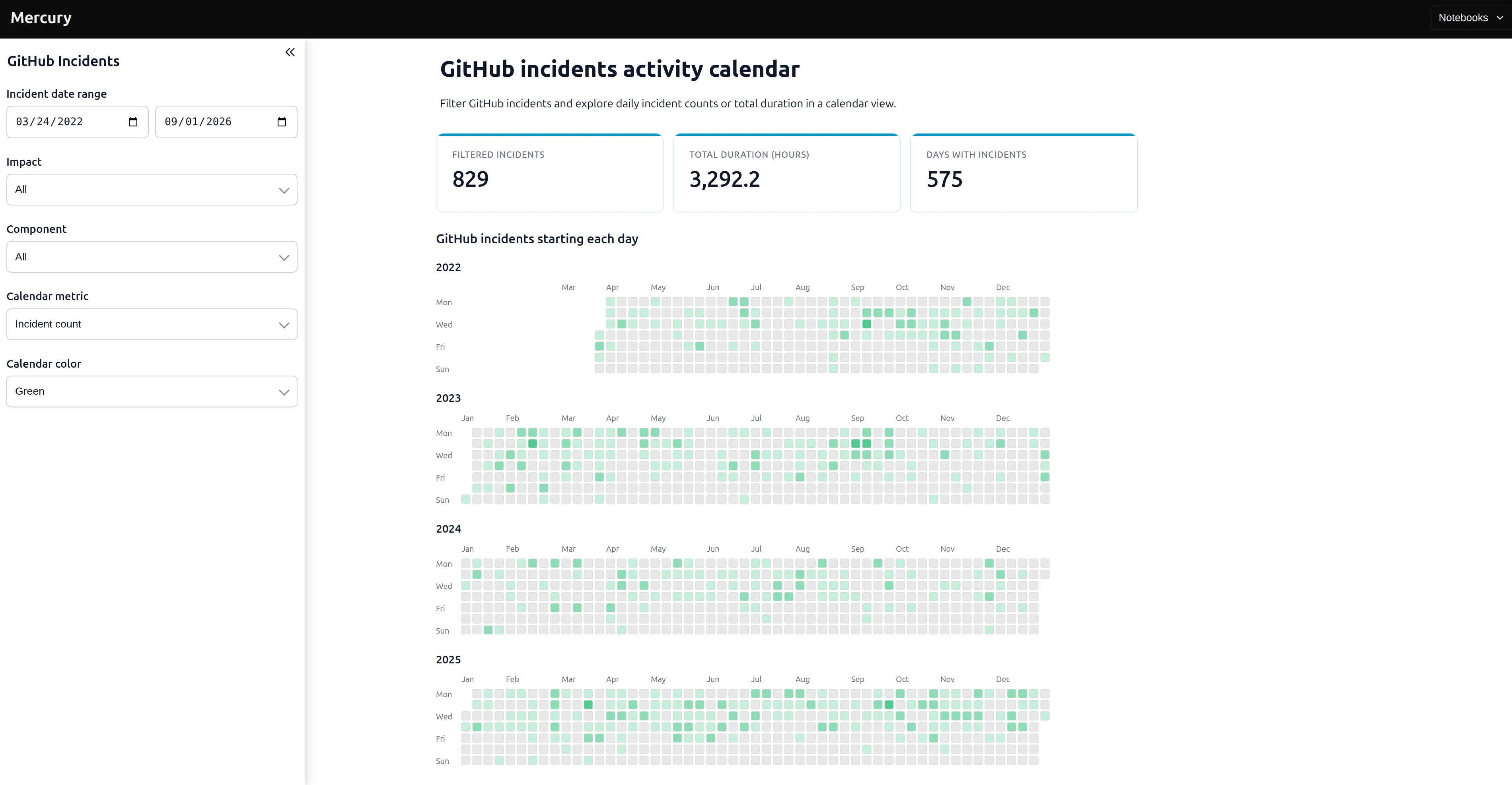
We turned the notebook into an interactive Mercury application where you can change:
- the date range,
- incident impact,
- GitHub component,
- whether the calendar represents incident count or total incident duration,
- and the calendar color.
The underlying notebook aggregates incidents by date before passing them to ActivityCalendar. The application can switch between the number of incidents and their summed duration in hours.
The complete GitHub incidents ActivityCalendar notebook is available on GitHub. You can also explore all the available options in the ActivityCalendar documentation.
Sankey: visualize relationships between categories
The second new widget is Sankey. A Sankey diagram represents relationships as ribbons. The width of each ribbon corresponds to its value, which makes it useful for displaying flows or connections between categories.
A basic Mercury Sankey needs only a source, target and value:
mr.Sankey(
    flows,
    source="source",
    target="target",
    value="value",
)
Mercury can also display values, customize node colors, and control the size and opacity of the ribbons. The diagram is generated in Python and rendered as SVG without relying on an external charting library. See the complete API in the Sankey documentation.
What happened to programming languages in tech hiring?
For the Sankey example, we used data from monthly Hacker News Ask HN: Who is hiring? threads. We wanted to compare programming-language mentions between different years—for example, 2012 vs. 2018 vs. 2026.
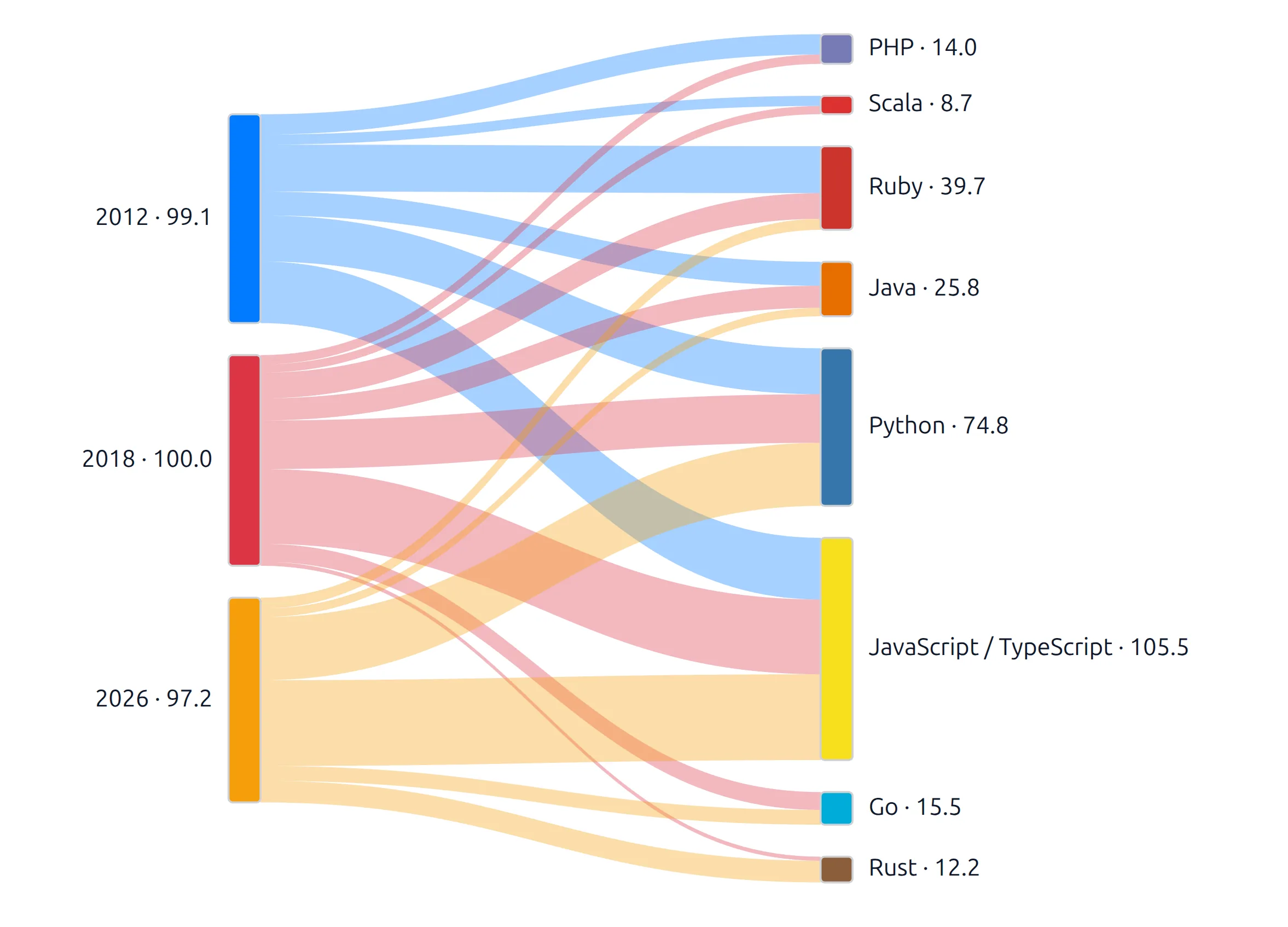
Each year is connected to the programming languages mentioned in job posts from that year. This creates an immediate visual comparison. In the example above, Python and JavaScript/TypeScript occupy much more of the diagram in the later periods, while languages such as Ruby have a very different relative position.
There is one important distinction: these ribbons do not mean that a Ruby job from 2012 somehow became a Python job in 2026. The diagram represents year → language mention relationships. It is a comparison of language mixes between periods, not a transition of individual jobs over time.
The full application lets the user select:
- years to compare,
- programming languages,
- and whether ribbon width represents the share of tracked language mentions or the number of posts mentioning a language.
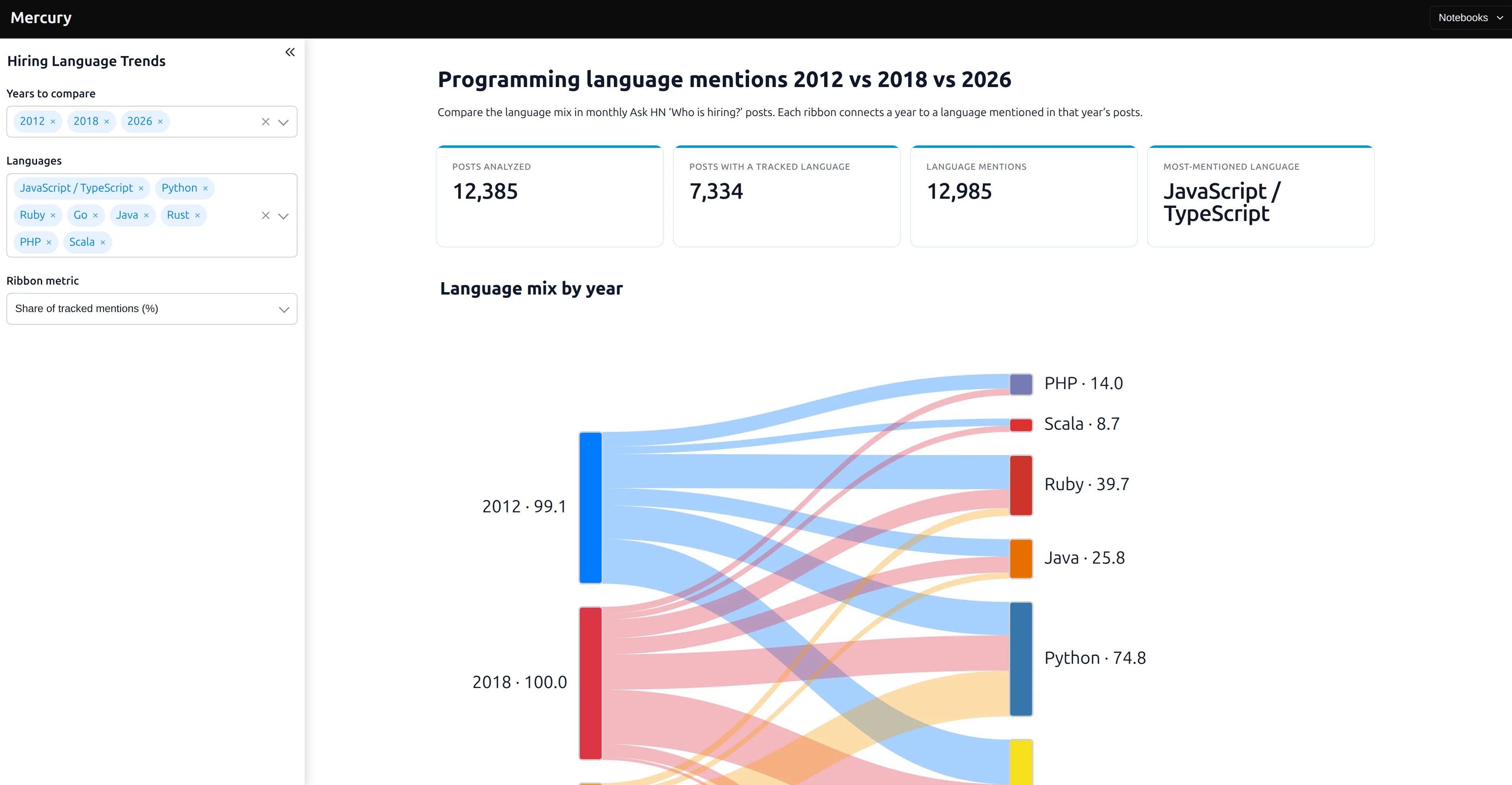
The notebook also calculates summary statistics, including the number of posts analyzed, posts containing a tracked language, total language mentions, and the most-mentioned language. You can find the source in the programming language Sankey notebook.
Funnel: how quickly does the perfect job disappear?
The third new widget is Funnel. Funnels are useful when you start with a large group and progressively narrow it using additional conditions.
mr.Funnel(
    funnel_data,
    stage="stage",
    value="entries",
    percentage="first",
)
Each stage has a name and a numeric value. Mercury preserves the order provided by your data and can show percentages relative either to the first stage or to the immediately preceding stage. See every option in the Funnel documentation. For our example, we returned to the Hacker News hiring dataset and asked a simple question:
How hard is it to find a remote Python data/ML job?
Start with every Who is hiring? entry from 2025. Then add requirements one at a time.
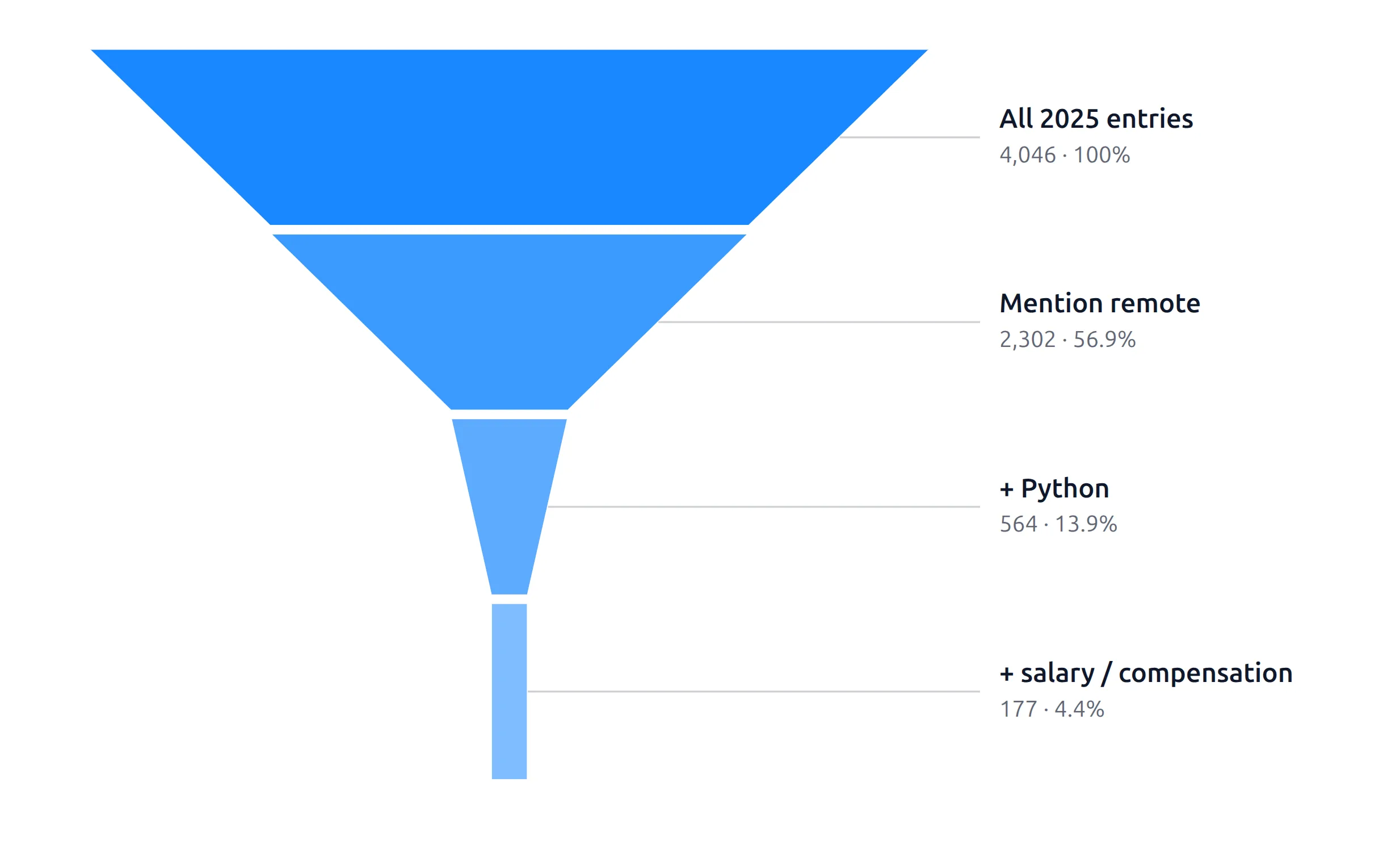
In this particular configuration:
All 2025 entries             4,046
        ↓
Mention remote               2,302
        ↓
+ Python                       564
        ↓
+ salary / compensation        177
Only a small fraction of the starting entries satisfy all the selected conditions. That is exactly the type of question for which a funnel is useful. Instead of looking only at the final number, you can see where opportunities disappear. And because this is Mercury, the criteria do not have to be hard-coded.
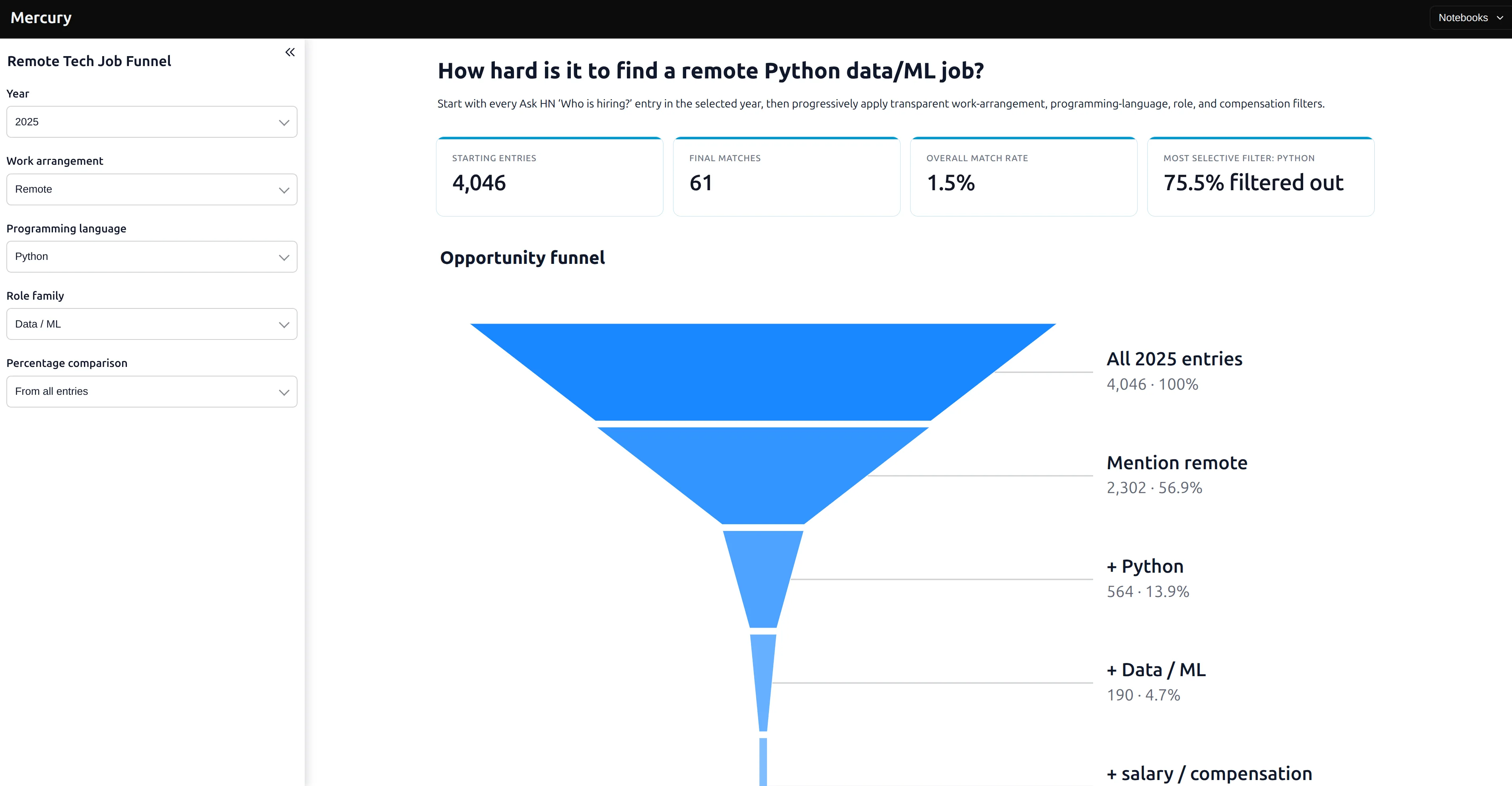
The application lets you change the year, work arrangement, programming language, and role family. The notebook then recalculates the funnel. For each selection, it also shows the starting number of entries, final matches, overall match rate, and which filter removed the largest percentage of remaining posts. The source is available in the Who Is Hiring Funnel notebook.
From visualization to interactive application
The individual charts are useful, but this is the part we find most interesting. All three examples started as regular Jupyter Notebooks. Python loads and transforms the data. Pandas calculates the values shown in the visualization. Mercury displays the result.
Then Mercury input widgets can be added around the analysis:
              Jupyter Notebook

Data
  ↓
Python / pandas
  ↓
User selects filters
  ↓
Analysis runs
  ↓
ActivityCalendar / Sankey / Funnel
  ↓
Interactive web application
There is no need to rewrite the analysis as a separate frontend application just because you want other people to interact with it. For example, changing Python to Rust in the hiring application causes the notebook to recalculate the relevant job population and redraw the funnel. Changing 2026 to 2012 in the programming-language application recalculates the flows displayed by the Sankey. Changing Incident count to Duration (hours) in the GitHub application changes what each calendar square represents. The visualization stays close to the Python code that generated it.
Three widgets, three different questions
We think about the widgets this way:
| Question | Mercury widget |
|---|---|
| When did something happen? | ActivityCalendar |
| How are things connected? | Sankey |
| What remains after each step? | Funnel |
They complement the existing Mercury output components, such as indicators, tables, Markdown, images, and progress bars. They also make it possible to build a wider range of data-oriented applications without leaving the notebook.
For another example of combining input controls with Python charts, explore our iPhone price analysis and Mercury dashboard. It lets readers compare launch prices, adjust for inflation, and filter by model line.
Try the new Mercury widgets
You can install or update Mercury with:
pip install -U mercury
Then import it in your notebook:
import mercury as mr
Read the documentation for ActivityCalendar, Sankey, and Funnel to see their complete APIs.
All three example notebooks are open source in the mercury-examples repository.
About the Author

Piotr Płoński
Piotr Płoński is a software engineer and data scientist with a PhD in computer science. He has experience in both academia—working on neutrino experiments at leading research labs and collaborating on interdisciplinary projects—and in industry, supporting major clients at Netezza, IBM, and iQor. In 2016, he founded MLJAR to make data science easier and more accessible, creating tools like AutoML, Mercury, and MLJAR Studio.
Related Articles
- 10 ways to make predictions with Machine Learning model
- Build a Web App for your Machine Learning model
- How to Run a Local LLM in 2026
- XGBoost Vector Leaf: Multi-Output Regression Explained
- GitHub Outages, Day by Day: A GitHub-Style Activity Calendar
- I Analyzed 4.5 Years of GitHub Incidents. Here Is What Changed.
- How Hard Is It to Find a Remote Python Data Job? I Checked 88,975 Hacker News Job Posts
- Are iPhones Really More Expensive? An Inflation-Adjusted Dashboard in Python
- How to Use Jev in Python: Choice, Noul, Score + OpenAI Comparison
- What Is an AI Agent Harness? Definition, Diagrams & Open-Source Examples
Private AI data analysis
AI Data Analyst on Your Computer
Use MLJAR Studio to explore data, discover insights, and create reports with AI.
Runs locally · Your data stays private