In this tutorial, we will train a simple machine learning model to predict medical insurance charges. We will use a decision tree. It is a good model for beginners because it is easy to understand. A decision tree works like a list of simple questions:
- Is the person a smoker?
- Is BMI higher than some value?
- Is the person older than some age?
The model uses the answers to these questions to predict insurance costs.
This tutorial is beginner friendly. You do not need to be scared of Python or machine learning. We will go step by step. All code in this tutorial was prepared in MLJAR Studio, a desktop application for data science. MLJAR Studio installs Python and prepares the working environment for you. You can focus on learning and working with data instead of spending time on technical setup.
The goal of this tutorial is not to build a production healthcare system. The goal is to understand how an explainable machine learning model can work with healthcare-style tabular data.
The code and data used in this article are available in my GitHub repository.
What You Will Learn
In this tutorial, you will learn how to:
- load healthcare-style data with Python,
- prepare text columns for machine learning,
- train a decision tree regression model,
- evaluate predictions on test data,
- understand MAE, RMSE, and R² Score,
- visualize predictions,
- explain the model with feature importance and tree plots.
Data
The data files are stored in the data directory.
We use two files:
train.csv- data used to train the model,test.csv- data used to check the model on new examples.
The dataset contains these columns:
| Column | Description |
|---|---|
age | Age of the person |
sex | Gender |
bmi | Body mass index |
children | Number of children or dependents |
smoker | Smoking status |
region | Residential region |
charges | Medical insurance charges |
In this tutorial, we want to predict charges column, which is a number. This is a regression task because predicted column is continuous (numbers). All other columns will be used as input data for the decision tree. Here is a diagram showing input columns, decision tree and predicted charges.

Load the Training Data
Let's look closer how the data looks like. Please use the following code to load the training data from the train.csv file.
import pandas as pd file_path = "data/train.csv" df = pd.read_csv(file_path) df.head()
This code does two things:
- Loads the training data
train.csvfromdatadirectory. - Displays the first rows of the dataset.
Here is an example view of the data:
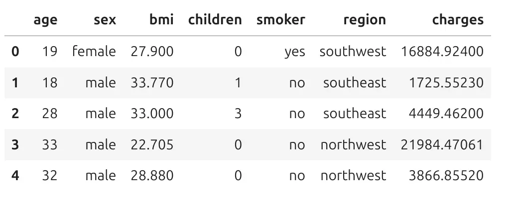
Each row is one person. Each column describes one property of this person. Let's take the first row. It has index 0.It describes the person who is 19 years old, is female, has BMI 27.9, zeor kids, is a smoker, and is from southwest region. She has hospitalization charges 16884 in charge units.
Machine learning is not magic. The model looks at many rows like this and tries to learn patterns. For example, the model can learn that smoking status is often connected with higher insurance charges. It can also learn that age and BMI can be useful for prediction.
Features and Target
In machine learning, we often use two important words:
- features - columns used to make predictions,
- target - column we want to predict.
In this dataset, the target is charges. The features are age, sex, bmi, children, smoker, region.
Let's split the data into features and target. We will select column charges from our data table ans assign to y variable. Other columns from table will be features, and will be denoted as X.
# target y = df["charges"] # features X = df.drop(columns=["charges"])
The variable y contains the real insurance charges. The variable X contains the input data used to predict charges.
Prepare Text Columns for Machine Learning
We need to prepare data to be in proper format for Machine Learning algorithm. By proper format I mean numbers. In our data, some columns contain text values:
sex smoker region
For example:
sexcan bemaleorfemale,smokercan beyesorno,regioncan besouthwest,northeast, and other regions.
In our tutorial we are going to use scikit-learn library which has implementation of Decision Tree algorithm. We need to convert text columns into numeric columns. This process is called encoding.
# encode categorical columns for sklearn cat_cols = ["sex", "smoker", "region"] X_encoded = pd.get_dummies( X, columns=cat_cols, drop_first=True ) display(X_encoded.head()) X_encoded.shape
The function pd.get_dummies() changes text categories into numeric columns. For example, the column smoker can become a new column:
smoker_yes
This column can have two values:
True - the person is a smoker False - the person is not a smoker
Now the model can use this information. Please note that True and False are boolean values, and are treated as 0 and 1 by algorithms. Here is how the encoded data looks:
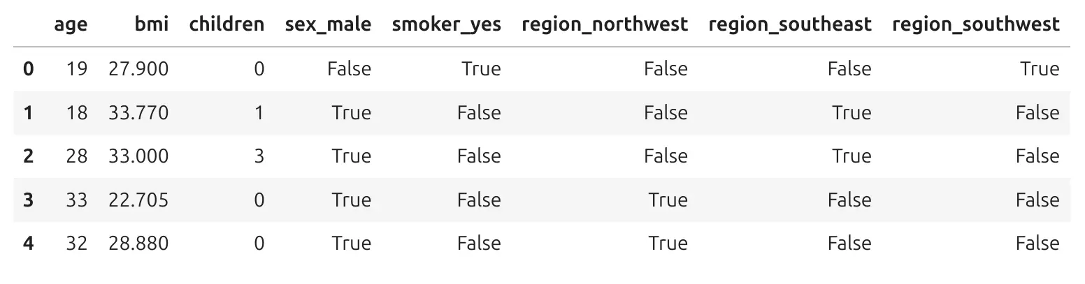
We still describe the same people, but now all columns are numeric.
Encoding text columns is a very common step in machine learning with tabular data.
Train a Decision Tree Regressor
Now we can train the model. We use DecisionTreeRegressor from scikit-learn. A regressor is a model that predicts numbers.
from sklearn.tree import DecisionTreeRegressor tree = DecisionTreeRegressor( max_depth=3, random_state=42 ) tree.fit(X_encoded, y) tree
Let's explain this code.
DecisionTreeRegressor(max_depth=3, random_state=42)
This creates a decision tree model. The parameter max_depth=3 means that the tree can have only 3 levels of questions. This is important. If the tree is very deep, it can become hard to read and explain. A smaller tree is easier to understand.
tree.fit(X_encoded, y)
This trains the model. You can read fit() as:
Learn patterns from the data.
The model looks at the encoded features and the real charges. It learns rules that help predict charges. When you display the decision tree you will see a table with its parameters:
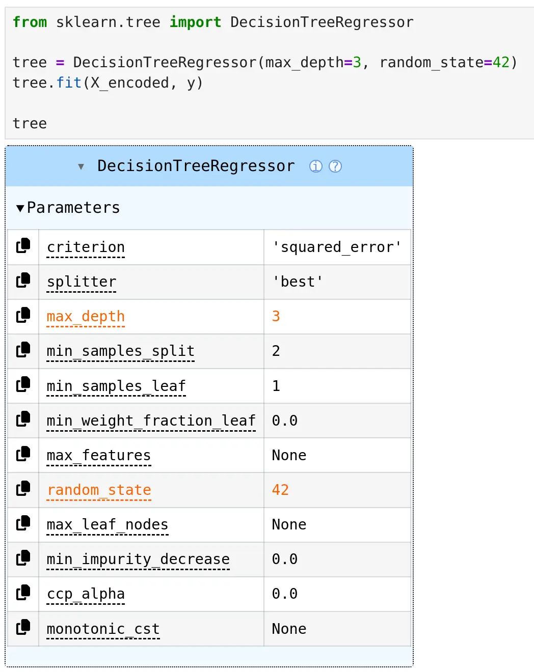
Some paramters have strange names, like ccp_alpha, but it shouldn't bother us. You can see that there are two values in table displayed in orange color, those values we set when constructing a tree model: max_depth=3 (number of questions in the tree) and random_state=42 (seed value for random numbers generator, so we can repeat training with the same result).
Why Decision Trees Are Easy to Explain
The table above with parameters is not decision tree visualization. We can visualize the structure of tree and it is useful because we can inspect how it works. It does not only give a prediction. It also gives a structure of decisions.
For example, the tree can ask:
Is smoker_yes <= 0.5?
This question separates non-smokers from smokers. Then it can ask another question about BMI or age. The model divides people into smaller groups. People in the same final group usually have similar insurance charges. This is easy to explain:
The model predicts costs by asking simple yes/no questions about the person.
Visualize the Tree with SuperTree
The notebook code uses supertree package to display the decision tree structure.
from supertree import SuperTree st = SuperTree( tree, X_encoded, y, target_names=["Charges"] ) st.show_tree()
SuperTree helps visualize the decision tree in an interactive and readable way. This is useful when you want to show the model to people who are not machine learning experts.
For example, in a healthcare team, you might want to explain the model to:
- medicine doctors,
- healthcare analysts,
- hospital managers,
- insurance specialists.
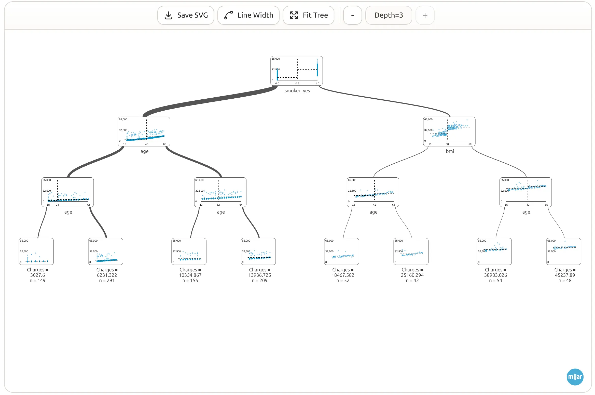
A visual tree is much easier to understand than a table of model parameters. Here is a full view of the tree:
Visualize a Very Small Tree
It is helpful to start with a very small tree - we can change depth of the tree in the top toolbar or by clicking on internal nodes. A tree with depth 1 has only one split. It asks one main (the most important) question.
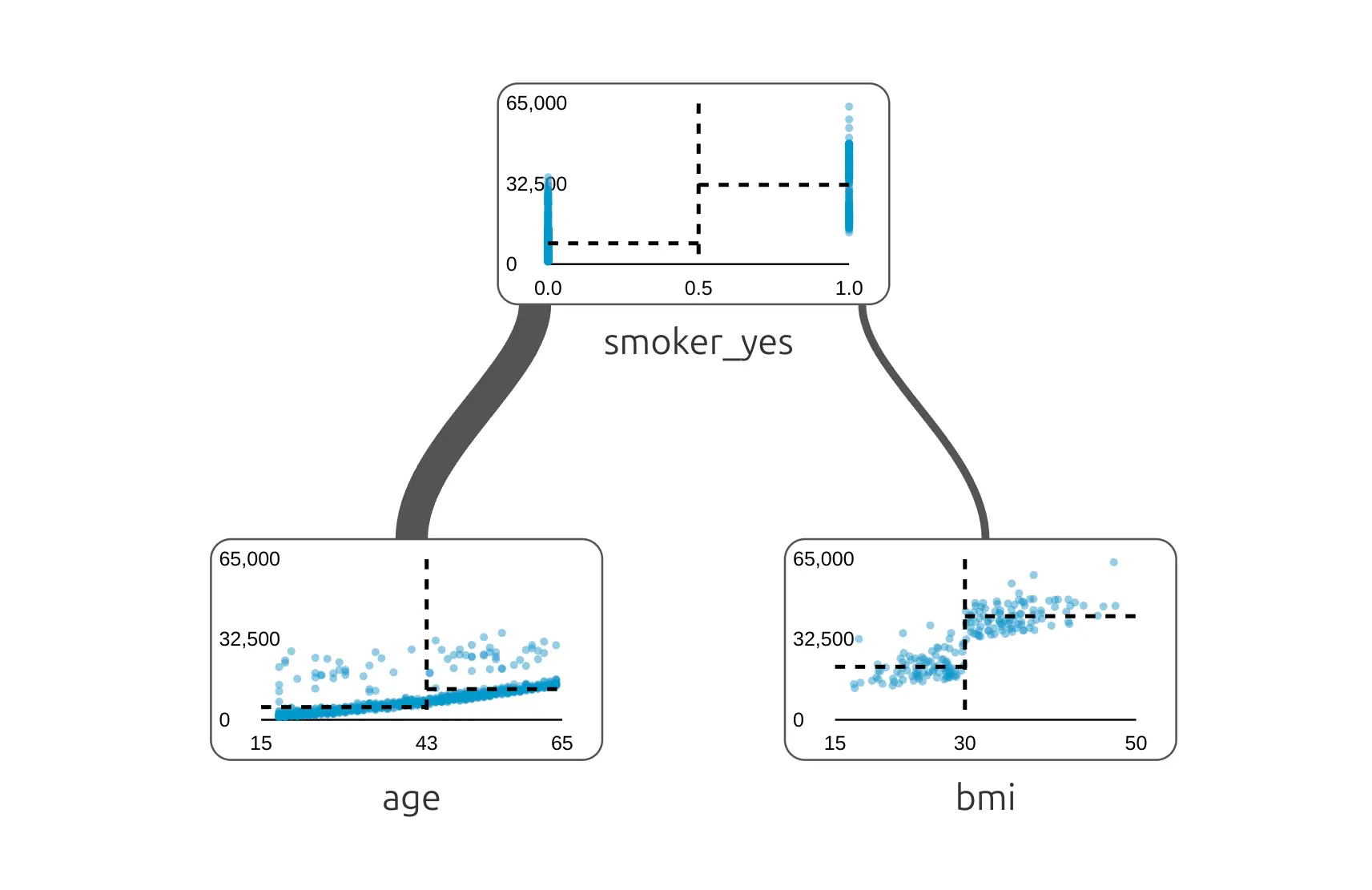
This first split is important because it shows which question the model finds most useful at the beginning. In many insurance charge datasets, smoking status is a very strong signal. In each node we have a distribution of data showing dependency between charges and feature used for the split.
Have you noticed that the edges are not the same width? The edge width indicates how many samples follow this path. The wider the edge, the more samples are in this path.
Add More Depth
When we allow the tree to be deeper, it can ask more questions.
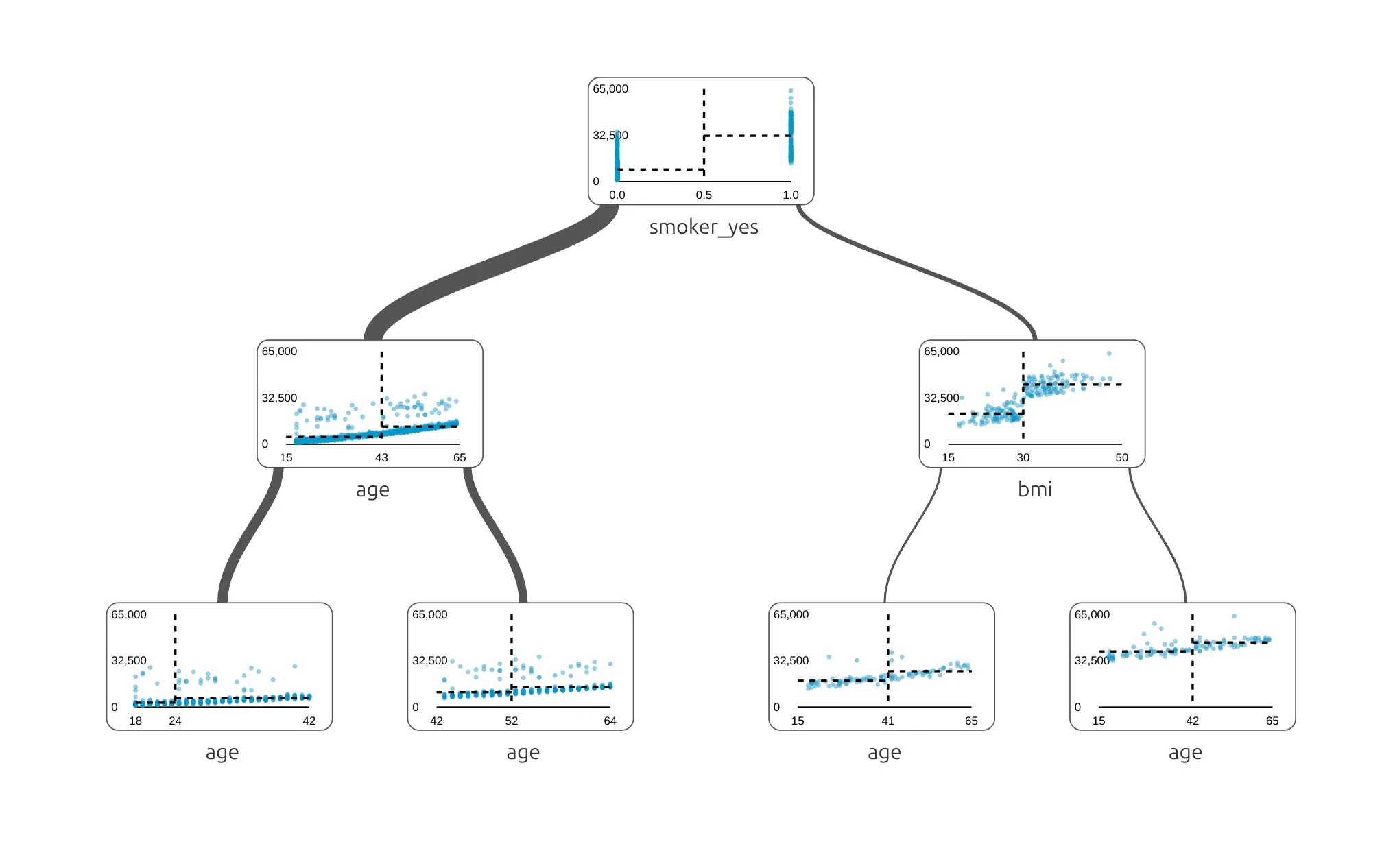
Now the model can create more groups. For example, it can split people first by smoking status, and then by BMI or age. A deeper tree can make more detailed predictions, but it can also become harder to read.
We see that there are nodes with age used multilpe times, and it is correct, The age values are splitted into groups, please take a closer look into x-axis values.
Tree with Depth 3
In this tutorial, we trained a tree with max_depth=3. In the final level of the tree, we have leaves. In each leaf, there is a charge value computed from mean charge values in that leaf - all samples that ended with this path to the leaf.
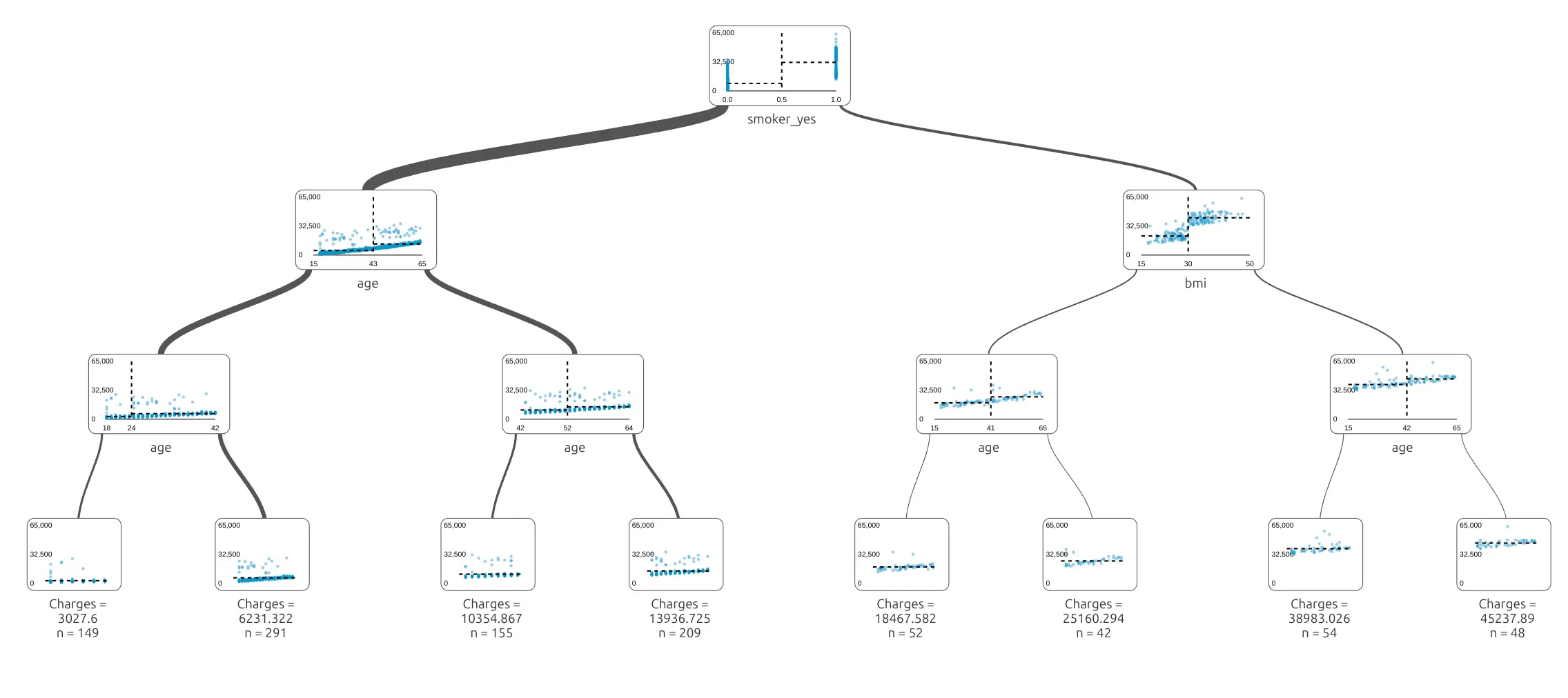
This tree is still small enough to understand. It can ask a few questions and separate people into groups with different expected charges.
Load the Test Data
After training the model, we need to test it on data that was not used for training. This is very important. If we only check the model on training data, we do not know if it can work on new examples. Let's load the test data.
test = pd.read_csv("data/test.csv") test_features = test.drop(columns=["charges"], errors="ignore") test_encoded = pd.get_dummies( test_features, columns=cat_cols, drop_first=True ) X_test_encoded = test_encoded.reindex( columns=X_encoded.columns, fill_value=0 ) X_test_encoded.head()
The test data needs the same preparation as the training data. We again encode text columns into numbers. Then we use:
X_test_encoded = test_encoded.reindex(columns=X_encoded.columns, fill_value=0)
This line is important. It makes sure that the test data has the same columns as the training data. Sometimes a category can appear in training data but not in test data. Sometimes the order of columns can be different. The reindex() step protects us from that problem.
The model expects the same columns during training and prediction.
Make Predictions
Now we can use the trained model to predict charges for the test data.
from sklearn.metrics import mean_absolute_error, mean_squared_error, r2_score import numpy as np import pandas as pd # Predict charges for test rows test_pred = tree.predict(X_test_encoded) # Real charges from the test data y_test = test["charges"] # Compute test metrics mae = mean_absolute_error(y_test, test_pred) rmse = np.sqrt(mean_squared_error(y_test, test_pred)) r2 = r2_score(y_test, test_pred) print("Test set metrics") print(f"Mean Absolute Error (MAE): {mae:,.2f}") print(f"Root Mean Squared Error (RMSE): {rmse:,.2f}") print(f"R² Score: {r2:.4f}")
The method:
tree.predict(X_test_encoded)
means:
Use the learned tree to estimate charges for new rows.
The variable test_pred contains predicted charges. The variable y_test contains real charges from the test data. Now we can compare them.
Create a Table with Predictions
Let's create a small table with real and predicted charges.
predictions_df = pd.DataFrame({ "actual_charges": y_test, "predicted_charges": test_pred }) predictions_df.head()
This table shows two columns:
actual_charges- the real known value,predicted_charges- the value predicted by the model.
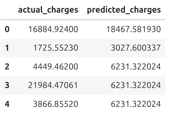
This is often the easiest way to understand what the model is doing. For each person in the test data, we can compare the real charge with the predicted charge. Let's take the first row, with index 0. The actual_charges is 16884 and predicted_charges is 18467. It is ok that model do not precisely predict the actual value. There is ~1600 error between actual and predicted value. We will later measure what are metrics on test data.
Visual Comparison of Predictions
A table is useful, but a chart can show the full picture. The notebook creates a scatter plot of actual charges and predicted charges.
import matplotlib.pyplot as plt import seaborn as sns plot_df = pd.DataFrame({ "actual_charges": y_test, "predicted_charges": test_pred }) plt.figure(figsize=(7, 6)) sns.scatterplot( data=plot_df, x="actual_charges", y="predicted_charges", alpha=0.5 ) min_val = min( plot_df["actual_charges"].min(), plot_df["predicted_charges"].min() ) max_val = max( plot_df["actual_charges"].max(), plot_df["predicted_charges"].max() ) plt.plot( [min_val, max_val], [min_val, max_val], color="red", linestyle="--" ) plt.title("Actual vs Predicted Charges") plt.xlabel("Actual Charges") plt.ylabel("Predicted Charges") plt.tight_layout() plt.show()
Let's do a plot:
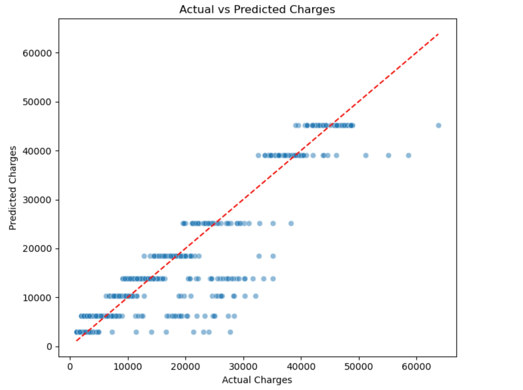
Each point is one person from the test data. The x-axis shows real charges. The y-axis shows predicted charges. The red dashed line shows perfect predictions. If a point is close to the red line, the prediction is good. If a point is far from the red line, the prediction error is larger. This chart helps us see where the model works well and where it makes mistakes.
You can see groups of points on the plot, do you know what are they? Those are persons that have the same path through the tree and finished in the same leaf.
Test Set Metrics
We can measre what is difference between actual values and precited. The model gives these results on the test set:
| Metric | Value | Simple meaning |
|---|---|---|
| MAE | 2,611.98 | On average, the prediction is wrong by about 2,612 charge units. |
| RMSE | 4,472.08 | This metric gives a stronger penalty to large mistakes. |
| R² Score | 0.8606 | The model explains about 86% of the variation in charges. |
These results are good for a simple decision tree with only 3 levels. We can't expect MAE or RMSE to be zero, or R² = 1, which would probably mean that there is a bug in our machine learning pipeline.
The MAE (Mean Absolute Error) value is easy to understand. It tells us the average prediction error. In this case, the model is wrong by about 2,611.98 charge units on average.
The RMSE (Root Mean Square Error) value is higher than MAE. This means that some predictions have larger errors. RMSE is useful because it shows when the model makes bigger mistakes.
The R² Score (R-Squared) is 0.8606. This means that the model explains a large part of the differences in insurance charges.
R² is not an accuracy percentage. But you can read
0.8606as a strong result for this tutorial. Perfect value for R² is1.
We should still be careful. Good metrics do not mean the model is ready for real healthcare or insurance decisions. We should also inspect charts, errors, and possible bias in the data.
Feature Importance
Decision trees can also tell us which features were most useful for prediction.
The notebook calculates feature importance like this:
importance_df = pd.DataFrame({ "feature": X_encoded.columns, "importance": tree.feature_importances_ }).sort_values("importance", ascending=False) plt.figure(figsize=(8, 6)) sns.barplot( data=importance_df, x="importance", y="feature" ) plt.title("Feature Importance from Tree Model") plt.xlabel("Importance") plt.ylabel("Feature") plt.tight_layout() plt.show()
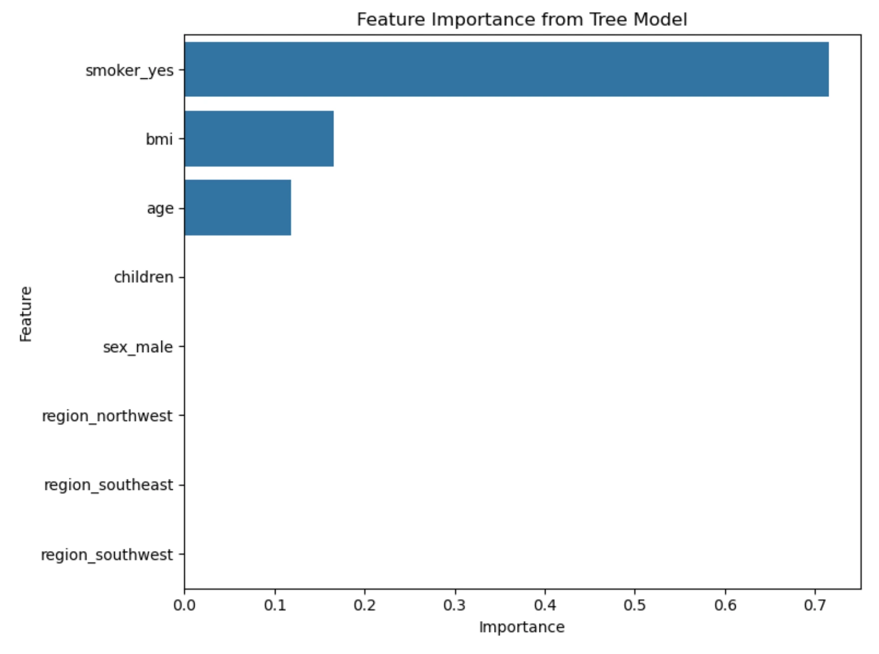
Feature importance tells us which columns helped the tree make predictions. For example, if smoker_yes has high importance, it means that smoking status was useful for predicting charges in this dataset. This does not mean that the model understands medicine like a doctor. It only means that this feature helped reduce prediction error in the data.
This is an important difference. Machine learning models find patterns in data. They do not understand the full medical context.
Look at Relationships in the Data
We can visualize the most important features found by Decision Tree. Charts help us understand if there are visible patterns. This is important in healthcare and insurance examples. We should not blindly trust a model. The notebook creates three charts:
import matplotlib.pyplot as plt import seaborn as sns import pandas as pd plot_train = df.copy() plot_train["smoker_yes"] = X_encoded["smoker_yes"].astype(int) palette = {0: "steelblue", 1: "orange"} fig, axes = plt.subplots(1, 3, figsize=(18, 5)) sns.boxplot( data=plot_train, x="smoker_yes", y="charges", ax=axes[0] ) axes[0].set_title("Charges by smoker_yes") axes[0].set_xlabel("smoker_yes") axes[0].set_ylabel("Charges") sns.scatterplot( data=plot_train, x="bmi", y="charges", hue="smoker_yes", palette=palette, alpha=0.6, ax=axes[1] ) axes[1].set_title("BMI vs Charges") axes[1].set_xlabel("BMI") axes[1].set_ylabel("Charges") axes[1].legend_.remove() sns.scatterplot( data=plot_train, x="age", y="charges", hue="smoker_yes", palette=palette, alpha=0.6, ax=axes[2] ) axes[2].set_title("Age vs Charges") axes[2].set_xlabel("Age") axes[2].set_ylabel("Charges") axes[2].legend(title="smoker_yes") plt.tight_layout() plt.show()
The first chart compares charges for smokers and non-smokers. The second chart shows the relationship between BMI and charges. The third chart shows the relationship between age and charges.
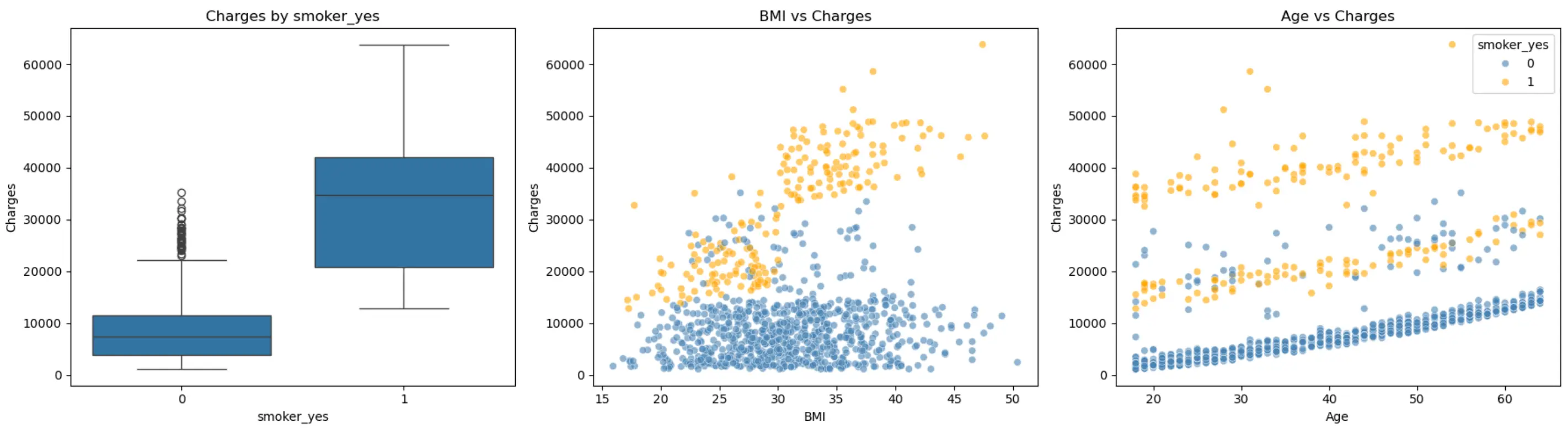
These charts show that the model has learned useful patterns. For example, smoking status can be a strong signal. BMI and age can also be related to charges. This does not mean that one column explains everything. Healthcare data is more complex. But charts help us start with a better understanding of the data.
Why This Is Useful in Healthcare
Healthcare data is usually tabular: age, lab results, diagnosis codes, medications, visit history, costs, risk factors. A model that works well on this kind of data needs to do more than predict accurately. It needs to be understood by the people who rely on it.
This is where decision trees stand out. Their rules are visible, not hidden inside the model, so a healthcare team can actually see the logic behind a prediction instead of trusting a black box. That matters in a sensitive area like healthcare, where a wrong or unexplainable decision can have real consequences.
A decision tree can help answer practical questions:
- Which features matter most?
- What groups have higher predicted costs?
- What rules is the model actually using?
- Do those rules make sense?
- Could the data be hiding some bias?
Being able to ask and answer these questions is what makes decision trees a strong starting point for explainable machine learning in healthcare.
Summary
In this tutorial, we walked through a full, simple machine learning workflow using healthcare-style data. We started with a raw dataset describing people and their insurance charges, and turned it into something a model could learn from by encoding text columns into numbers.
We trained a decision tree to predict insurance charges, keeping it small on purpose so it would stay easy to read and explain. Rather than just trusting the model's output, we tested it on new data it had never seen, and looked closely at how its predictions compared to reality.
Along the way, we used charts and metrics not as a final verdict, but as tools to understand the model: where it did well, where it struggled, and which features it relied on most. This is the real value of a decision tree. It does not just give you a number. It shows you the reasoning behind that number, in a way anyone on a healthcare or insurance team could follow.
The result is a transparent model that explains its own decisions, built using nothing more than a few common Python tools.
Curious how a stronger model would handle this same data? Give MLJAR AutoML a try — it's open-source Automated Machine Learning Python package, and it keeps the same kind of explainability you saw here, just with more models doing the work.