
Files
CSV, Excel, JSON, Parquet
Add a filter, plot a chart, done. Mercury turns your notebook cells into a dashboard your team can open in a browser — no callbacks, no separate frontend.
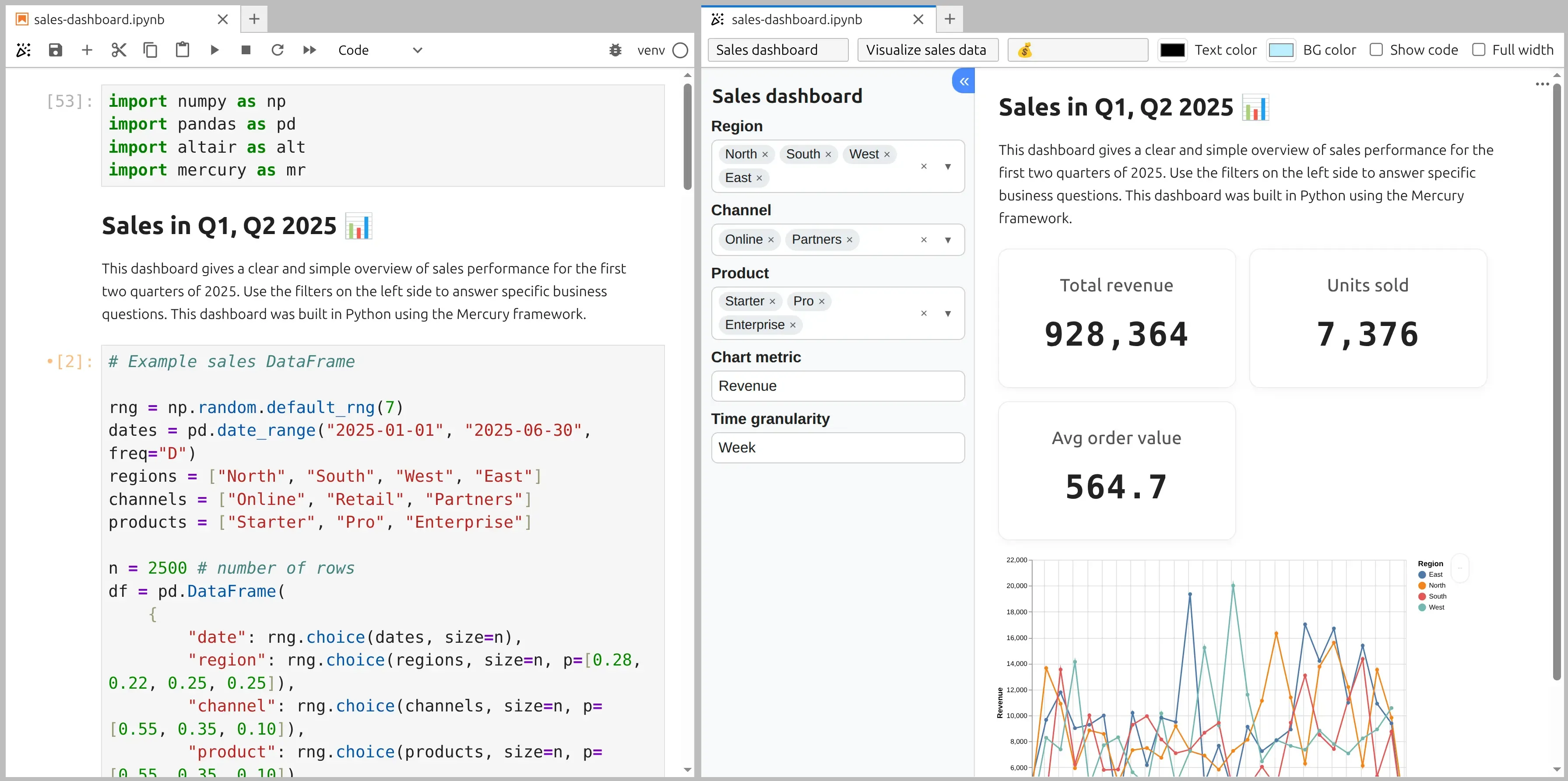
A dashboard in Mercury is a notebook where changing an input — a dropdown, slider, checkbox, or number — recalculates the chart or table below it. Your team uses the controls in a browser while your pandas and plotting code stays in the notebook.
You are not maintaining a data pipeline and a separate user interface. A Mercury widget exposes a normal Python value, such as region.value, which you use in the cells below it. Mercury handles the clean browser layout and reactive execution.
Related guides
Choose between publishing the analytical notebook and building a separate dashboard application.
Compare notebook cell order with Dash layouts, callbacks, and application infrastructure.
Read nextCompare downstream cell execution with Streamlit caching, Session State, and fragments.
Read nextAdd styling, access protection, and deployment to the notebook dashboard workflow.
Read nextComplete example
The widget lives in its own cell. The filtering and chart stay below it, so Mercury knows exactly what to recompute after the selection changes.
# Cell 1 — import packages and load data
import pandas as pd
import altair as alt
import mercury as mr

df = pd.read_csv("sales.csv")# Cell 2 — add a dashboard filter
region = mr.Select(
label="Region",
choices=["All", "North", "South", "East", "West"],
value="All"
)# Cell 3 — filter data and display the chart
filtered = df if region.value == "All" else df[df["region"] == region.value]
chart = alt.Chart(filtered).mark_bar().encode(
x="month",
y="revenue"
)
chartChange “Region” in the browser, and the chart updates automatically. Mercury re-runs the cells below the changed widget.
Your data
Your data can live in a file, database, API, or cloud service. Load it with normal Python, then use the resulting DataFrame in your dashboard.
CSV, Excel, JSON, Parquet
PostgreSQL, MySQL, SQLite, Snowflake
REST APIs and JSON responses
Amazon S3, Google Cloud, Azure
Interactive controls
Add familiar controls so people can filter data, compare groups, and test different values without editing your Python code.
A practical example of five Mercury widgets
mr.SelectShow one region at a time.
mr.MultiSelectCompare several groups together.
mr.SliderFilter with a clear numeric threshold.
mr.NumberInputEnter an exact value for the calculation.
mr.CheckBoxTurn an optional part of the dashboard on or off.
One simple rule
Every widget works the same way: its value updates the cells below it. For installation, live preview, styling, authentication, and deployment, read the complete guide to turning a Jupyter notebook into a web app.
FAQ
No. The notebook contains both the analysis and the application logic. Mercury supplies the browser interface and runs the notebook for each interaction.
Yes. Mercury displays standard notebook outputs, so Altair, Matplotlib, and Plotly charts can all be used in a dashboard.
Tableau and Power BI are primarily point-and-click tools. Mercury is code-first: data preparation, custom calculations, and any logic you can write in Python can remain part of the dashboard.
A widget interaction re-runs the notebook cells below that widget. If the database query is in those cells, the data is loaded again. Mercury does not add background auto-refresh or real-time streaming by itself.
Yes. Mercury supports a shared password, and user-based authentication is available as a paid add-on. Read about authentication.
Start with the notebook you already have. Add a Mercury control, preview the dashboard in your browser, and share it with your team.
pip install mercury