
You have a sales spreadsheet, and every week someone asks you a slightly different question about it.
How did the North region do last month? Can you show only Keyboard sales? Can you remove Standing Desks? Can you send me the numbers for the first two weeks of January?
You open the spreadsheet, apply a filter, calculate the numbers, take a screenshot, and send it. Then another question arrives and you repeat the same work.
Instead of answering each question yourself, you can turn the spreadsheet analysis into a small web app. The people who need the numbers can choose a date range, region, or product themselves, and the results update automatically.
In this tutorial, we will build that app with Python, Mercury, and MLJAR Studio. We will not ask AI to create the whole dashboard in one prompt. We will build it one piece at a time, run each part, inspect the result, and then continue. This makes it much easier to understand what the app is doing and to change the layout while we work.
The final result is still a normal Jupyter notebook. We are adding an interface around our Python analysis rather than rewriting it as a separate web application.
What we are building
We will start with one month of sales data and create a small dashboard with a date filter, region filter, and product filter. The app will show four summary numbers, a daily revenue chart, and a table with results for each region.
The important part is that all of these elements use the same filtered dataframe. When somebody changes a filter, the calculations update together.
Get the data
Download the demo files from datasets-for-start and save them in:
~/Documents/sales/
For this tutorial, we use 2025-01.xlsx. It contains 503 January orders.
Mercury, the open-source Python library we will use to turn the notebook into a web app, is included with MLJAR Studio, so there is no separate Mercury installation needed for this tutorial.
How the notebook becomes an app
A Mercury app is still a notebook. We use normal pandas code for loading, filtering, and calculating the data, then add widgets such as a date picker or dropdown.
When somebody changes a widget, Mercury reruns the notebook using the new value and shows the updated output.
That is the basic idea.

We will build the dashboard one cell at a time. This is especially useful when working on layout because you usually want to see the result before deciding what should come next.
A chart might look better beside the table than above it. The indicators might need another title. A filter may belong higher on the page. These are easier decisions to make while looking at the app than while describing the whole layout in advance.
Use AI to help with individual pieces
MLJAR Studio also has an AI assistant in the sidebar. When working inside a notebook, it can suggest code for the cell you are editing.
It does not automatically run that code. You can read the suggestion first and decide whether to insert it above, below, or instead of the current cell.

For example, you can ask:
update title above indicators
and use the suggested code if it fits what you want.
I like this workflow for building a dashboard because the AI helps with small pieces while you stay in control of the notebook structure. You can see the code before adding it and immediately inspect what changes in the app.
Load the Excel data
Start with the imports and the spreadsheet:
import pandas as pd import altair as alt import mercury as mr file_path = "/home/piotr/Documents/sales/2025-01.xlsx" sales = pd.read_excel(file_path, sheet_name="Orders")
We use pandas for working with the spreadsheet, Altair for the chart, and Mercury for the app interface.
The workbook contains 503 January orders, covering January 1 through January 31.
For now, we use the full local file path. Later, before publishing the app, we will change it because /home/piotr/Documents/... only exists on this computer.
Add the filters
Next, create the controls that people will use at the top of the app:
min_date = sales["order_date"].min().date() max_date = sales["order_date"].max().date() date_filter = mr.DateRange( label="Order date", value=[min_date, max_date], min=min_date, max=max_date, ) region_filter = mr.MultiSelect( label="Region", choices=sorted(sales["region"].dropna().unique().tolist()), value=sorted(sales["region"].dropna().unique().tolist()), ) product_filter = mr.MultiSelect( label="Product", choices=sorted(sales["product"].dropna().unique().tolist()), value=sorted(sales["product"].dropna().unique().tolist()), )
This creates three controls: a date range, a region selector, and a product selector.
Notice that we do not type region or product names manually. They come directly from the spreadsheet:
sales["region"].dropna().unique()
and:
sales["product"].dropna().unique()
That makes the notebook easier to reuse. If a new region or product appears in another file, it can automatically appear in the filter too.
The value= argument controls what is selected when the app first opens. We select everything by default, so the visitor starts by seeing the full month.
Keep this cell near the top of the notebook because Mercury displays widgets in notebook order, and filters make more sense before the results they control.
Apply the filters to the data
Creating the widgets is only the first half. Now we need to use their values to filter the dataframe:
start_date, end_date = pd.to_datetime(date_filter.value) filtered_sales = sales[ (sales["order_date"] >= start_date) & (sales["order_date"] <= end_date) & (sales["region"].isin(region_filter.value)) & (sales["product"].isin(product_filter.value)) ].copy()
This creates a new dataframe called filtered_sales.
The date condition keeps orders inside the selected period. .isin(region_filter.value) keeps only the selected regions, and the same pattern is used for products.
The & between the conditions means that all conditions need to be true.
From this point on, the dashboard should use filtered_sales instead of the original sales dataframe. That is what connects the rest of the notebook to the filters.
Add the headline numbers
Now we can calculate the most important numbers for the selected data:
total_revenue = filtered_sales["revenue"].sum() total_orders = filtered_sales["order_id"].nunique() total_units = filtered_sales["units"].sum() average_order_value = ( filtered_sales.groupby("order_id")["revenue"].sum().mean() if total_orders > 0 else 0 ) mr.Markdown("## Key performance indicators") mr.Indicator( [ mr.Indicator( label="Total revenue", value=f"{total_revenue:,.2f} USD", ), mr.Indicator( label="Orders", value=f"{total_orders:,}", ), mr.Indicator( label="Units sold", value=f"{total_units:,}", ), mr.Indicator( label="Average order value", value=f"{average_order_value:,.2f} USD", ), ] )
With all filters selected, January gives us:
| Metric | Value |
|---|---|
| Total revenue | 363,879.30 USD |
| Orders | 503 |
| Units sold | 8,762 |
| Average order value | 723.42 USD |
There is a small but important check inside the average calculation:
if total_orders > 0 else 0
Someone can use the filters to select a combination with no matching orders. Without this check, we could end up trying to calculate an average from an empty dataset.
Instead, the indicator shows zero and the app continues working.
Add the daily revenue chart
Next, let us show how revenue changes through the month.
First, calculate revenue for each day:
daily_sales = ( filtered_sales.groupby("order_date", as_index=False)["revenue"] .sum() .sort_values("order_date") )
Then create an Altair chart:
revenue_chart = ( alt.Chart(daily_sales) .mark_line(point=True, color="#2563eb") .encode( x=alt.X("order_date:T", title="Order date"), y=alt.Y("revenue:Q", title="Revenue (USD)"), tooltip=[ alt.Tooltip("order_date:T", title="Date"), alt.Tooltip( "revenue:Q", title="Revenue", format=",.2f", ), ], ) .properties( title="Daily revenue", width="container", height=400, ) .interactive() )
groupby("order_date") gives us one revenue value for each day in January.
The tooltip lets people hover over the line and see the exact value. width="container" allows the chart to adapt to the available space, and .interactive() adds zooming and panning.
At this point, we have created the chart but have not yet placed it in the app layout. We will do that after creating the table.
Create the summary table
Now calculate orders and revenue for each region:
summary_stats = ( filtered_sales.groupby("region", as_index=False) .agg( total_orders=("order_id", "nunique"), total_revenue=("revenue", "sum"), ) .sort_values("total_revenue", ascending=False) ) summary_stats["total_revenue"] = summary_stats["total_revenue"].map( lambda value: f"{value:,.2f} USD" )
With the full January data selected, the table looks like this:
| region | total_orders | total_revenue |
|---|---|---|
| North | 152 | 114,891.70 USD |
| South | 141 | 97,687.40 USD |
| West | 121 | 83,745.90 USD |
| East | 89 | 67,554.30 USD |
There is one useful detail in this code: we sort the values before converting the revenue numbers into formatted text.
Once 114891.70 becomes 114,891.70 USD, it is a string rather than a number. Sorting strings follows text rules, not numeric rules.
That can produce a table that looks reasonable but is in the wrong order, so calculate and sort first, then format for display.
As another check, the four regional revenue values add up to 363,879.30 USD, which matches our total revenue indicator.
Put the chart and table side by side
Now we can create two columns:
left, right = mr.Columns(2)
Display the chart on the left:
with left: left.clear() display(revenue_chart)
and the table on the right:
with right: right.clear() mr.Table(summary_stats)
mr.Columns(2) creates a two-column layout.
The clear() calls are useful because Mercury reruns the notebook when someone changes a filter. Clearing the column before drawing prevents old versions of the chart or table from being left behind after a rerun.
At this point, the main dashboard is ready.
Preview the app while you build it
You do not need to finish the whole notebook before seeing what the app looks like.
Use the preview button in the toolbar to open the live app next to the notebook.

This is especially useful when adjusting layout. You can change a cell, run it, and immediately see how the result looks in the app.
The screenshot above has some products deselected, so the numbers are smaller than the full January totals we calculated earlier. That is the filters working.
You can also configure how the app presents itself.

For this example, we can use the title Sales dashboard, description Sales performance, and a 💰 emoji.
You can also control the background and text colors, whether visitors can see the notebook code, and whether the app uses the full width of the browser.
For a dashboard, full width usually works well because charts benefit from the extra space.
Prepare the notebook for publishing
The dashboard works on our computer, but before publishing it we need to make a few small changes.
Change the file path
Right now the notebook uses:
file_path = "/home/piotr/Documents/sales/2025-01.xlsx"
That path exists only on this computer. Once the notebook runs on a server, there will probably be no /home/piotr/Documents/sales/ directory.
Change it to:
file_path = "2025-01.xlsx"
Now Python looks for the spreadsheet next to the notebook. That works locally when the files are together, and it also works when we upload both files to the server.
Add requirements.txt
The server also needs to know which Python packages the notebook uses.
Create a requirements.txt file containing:
pandas altair openpyxl
openpyxl is easy to forget because we do not import it directly. Pandas uses it behind the scenes to read .xlsx files.
Without it, pd.read_excel(...) can work perfectly on your computer and fail on the server because the Excel engine is missing.
Mercury itself does not need to be listed because it is already available on the platform.
Keep the three files together
For this app, we need three files:
| File | Purpose |
|---|---|
dashboard.ipynb | The notebook and app |
2025-01.xlsx | The sales data |
requirements.txt | Python dependencies |
Publishing the notebook does not make the Excel file part of it. The app still needs access to the workbook it reads.
You can upload these files during publishing or manage them later on MLJAR Platform.

If the app starts but reports that it cannot find 2025-01.xlsx, check whether the spreadsheet was uploaded.
If the application fails during startup, requirements.txt is one of the first things worth checking.
Publish the web app
When everything works in preview, click Publish in the toolbar.

Choose the Mercury page where you want to publish the notebook.

Then select the files to upload. For this tutorial, choose the notebook, the Excel workbook, and requirements.txt.

After the upload, Studio shows the app address.

Open that address in a browser.

The notebook is now a web interface.
People can choose filters without opening the spreadsheet or editing Python. With the full January dataset selected, the app shows the same results we calculated in the notebook: 363,879.30 USD in revenue from 503 orders, with North as the largest region at 114,891.70 USD.
This check matters too. Publishing changes how people interact with the analysis, but it should not change the numbers.
The app also works on a phone
The layout adapts when the browser becomes narrower.
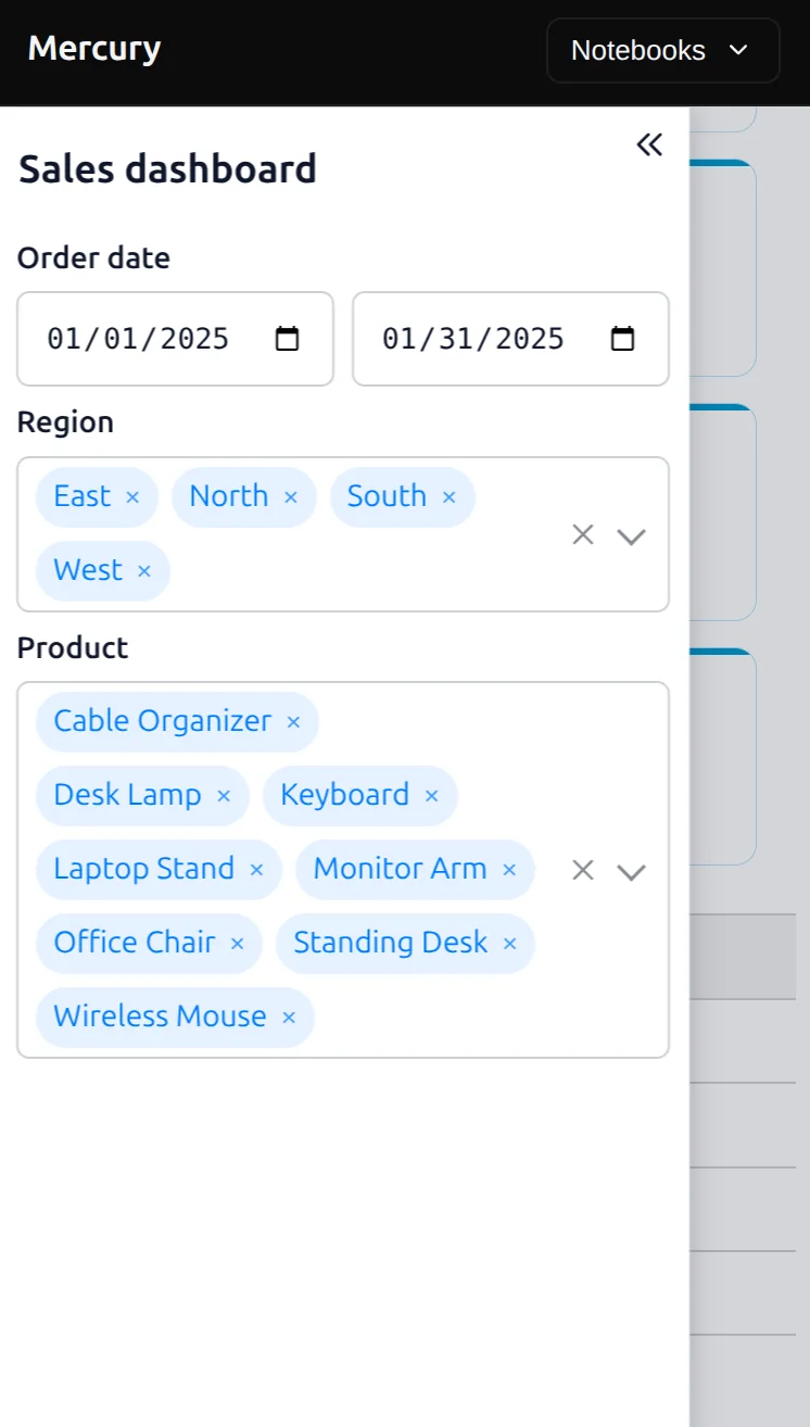
On a phone, the filters use more of the available width and the results move underneath them.
There is no separate mobile application to maintain. It is the same notebook and the same app.
That makes the dashboard useful when somebody is away from their desk and only wants to check a number quickly.
Decide who should have access
Once the dashboard is online, you also need to decide who should be able to open it.
For public or demo data, a public link may be enough.
For an internal report, you can protect the app with a password so only people who know it can access the dashboard.
Mercury is also open source, so you can run the application on your own infrastructure. That can be useful when the data should stay inside your network rather than being hosted on an external server.
The important part is to match the deployment method to the data you are working with. A public sales demo and an internal financial dashboard should not automatically use the same access settings.
What we actually built
It is worth looking back at the notebook.
Most of the code is ordinary data analysis. We load an Excel file with pandas, filter rows, calculate sums, use groupby(), and build an Altair chart.
The parts that turn it into an application are comparatively small. We added a few Mercury widgets for inputs, indicators for the headline values, and columns for the layout.
That means we do not need to maintain one analysis notebook and a completely separate web application. The notebook is the application.
When the underlying analysis changes, we update the notebook. When next month's data arrives, we can replace the spreadsheet or extend the workflow to load another file.
Take it further
One useful next step is to let visitors provide their own spreadsheet instead of keeping 2025-01.xlsx fixed in the notebook.
Mercury has an UploadFile widget for that. The same dashboard could then work with different monthly exports without changing the Python file path manually. The Jupyter notebook to web app guide covers more Mercury widgets, styling, authentication, and deployment options.
You can also customize the colors, fonts, and layout so the app matches the rest of your internal tools.
The important part is that these improvements can be added gradually. You do not need to design the final application before starting.
Build one part, inspect it, and then decide what should come next.
What we did
We started with a normal Excel sales file and a Python notebook. First, we loaded the data. Then we added a date range, region selector, and product selector.
We used those values to create filtered_sales, and every later calculation used that filtered dataframe. From it, we created four headline indicators, a daily revenue chart, and a table with regional results.
We arranged the chart and table into a simple dashboard and used the live preview to inspect the interface while building it.
Finally, we changed the local file path, added the required dependencies, uploaded the notebook and its data, and published the result as a web app.
We deliberately did not create everything with one AI prompt. Building the dashboard step by step makes it easier to understand what each part does, check the numbers, adjust the layout, and catch problems before publishing.
Next steps
If dataframe selection, filtering, sorting, and calculated columns are new to you, start with Python for Excel Users. Then continue with Excel formulas in Python to understand the pandas calculations behind this dashboard.
You can also use Merge all Excel files in a folder to build the same dashboard from a full year instead of one month.
Before publishing business data, Clean messy Excel data is also worth reading.
For more dashboard patterns and data-source options, explore Python dashboards from notebooks. For a broader guide to widgets, styling, access control, and deployment, see Turn a Jupyter notebook into a web app.