Python Dashboard for 15,963 Data Analyst job listings
The US job market is filled with exciting opportunities for aspiring Data Analysts. However, landing your first job can be challenging due to the diverse range of requirements employers are looking for. In this article, we analyze data from 15,963 Data Analyst job listings. We build a Jupyter Notebook with data analysis and visualization, and serve it as an interactive web app. For example, we search for the most needed skills and show their dependency on the average yearly salary. Let's check what the most needed skills for Data Analyst are!
The outline for this article:
- About dataset
- Import needed libraries
- Data preprocessing
- Creating charts
- Exploratory data analysis (EDA)
- Share your analysis as a web app
- Summary
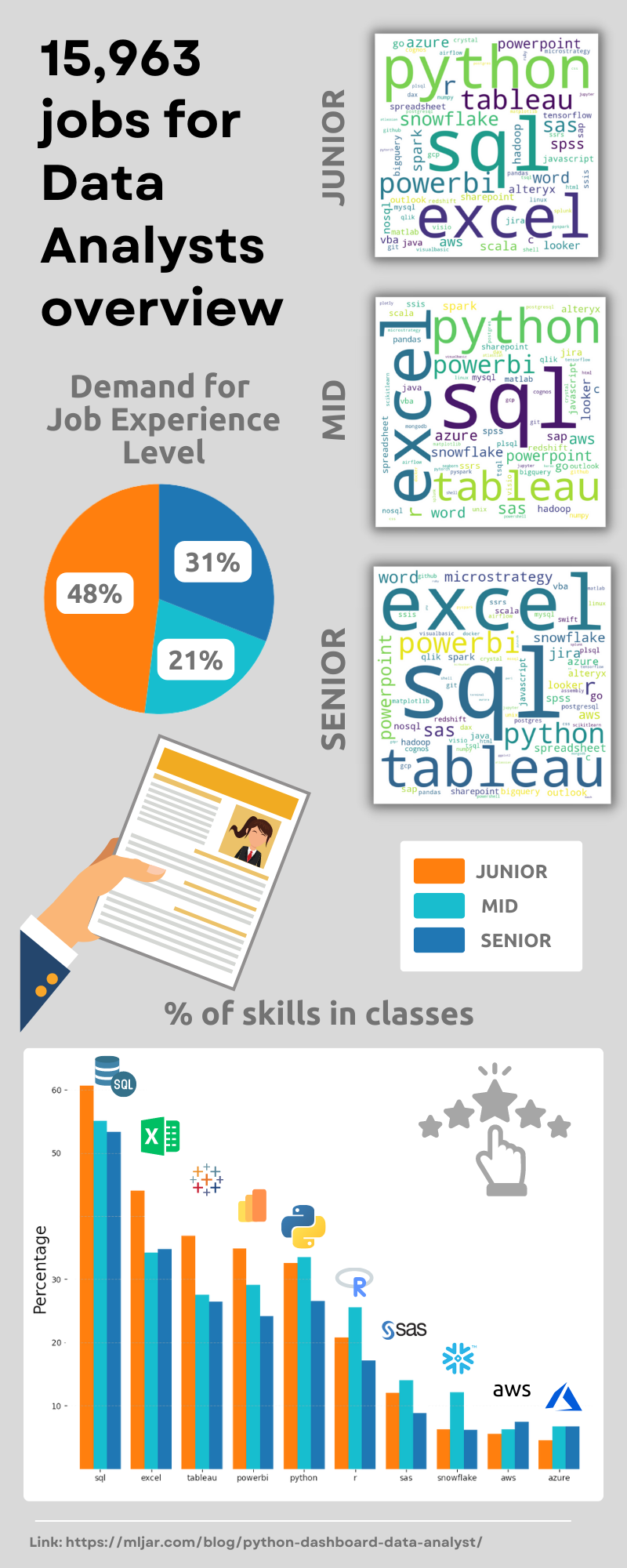
Infographic
1. About dataset
We use Data Analyst Job Postings dataset available at kaggle.com website. This dataset pulls job postings from Google's search results for Data Analyst positions in the United States every 6 hours. It has the following information about listing:
title- a job title,company_namethe company that listed the job posting,location- city and state,via- which is information about social media platforms used to post a job listing,description- full description of the job posting,extensions- common keywords for the job posting,salary- salary from job posting,description_tokens- tokens with skills.
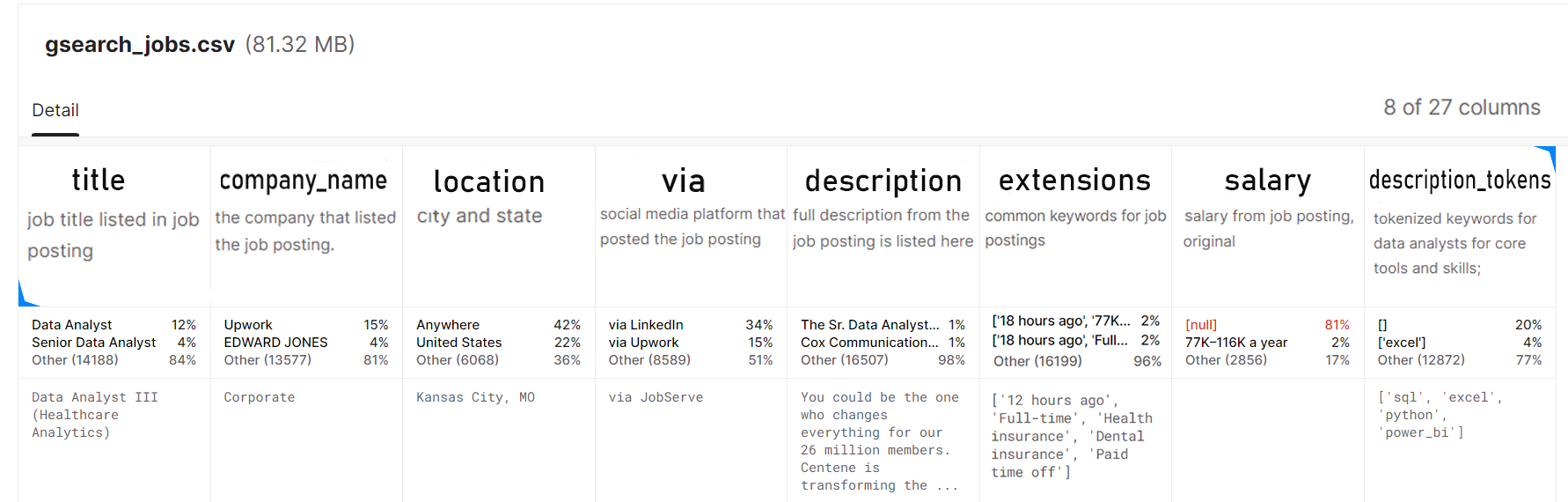
- The dataset has 15,963 job offers.
- 81% of the payout data is missing. Understandably, most companies will want to negotiate the price.
The data and notebook from this article are available on the GitHub repository.
2. Import needed libraries
We use the Jupyter Notebook for conducting analysis. It is a popular tool for prototyping and exploring data because of its interactive interface. It provides rich output capabilities for visualizations, plots, and interactive widgets. we need the following packages:
matplotlib>=3.6.2
mercury>=2.2.7
numpy>=1.24.0
pandas>=1.5.2
wordcloud>=1.8.2.2
In the first cell, we import required libraries:
import numpy as np
import pandas as pd

import matplotlib.pyplot as plt
import mercury as mr
from wordcloud import WordCloud

from dateutil.parser import parse
from string import punctuation as punct
Packages explanation:
- numpy provides support for numerical operations,
- pandas is a library for data manipulation and analysis,
- matplotlib.pyplot allows you to visualize data and create charts,
- mercury allows you to create pages from the notebook and add widgets,
- wordcloud allows the creation of word clouds,
- dateutil.parser provides tools for parsing and manipulating dates and times,
- string contains a set of constants, such as punctuation marks, that can be used in operations on text.
Load data
Data is available as CSV file (zipped to use less space). Let's load it with pandas package:
df = pd.read_csv("df-job-al.zip")
df = df.drop(columns=["Unnamed: 0", "index"])

# Removes punctuation marks from strings, and then splits each string into a list of words.
remove_punct = lambda x: x.translate(str.maketrans('', '', punct)).split()
df.extensions = df.extensions.apply(remove_punct)
df.description_tokens = df.description_tokens.apply(remove_punct)
3. Data preprocessing
Data processing is one of the more difficult parts of the analysis. It requires good planning of operations and preparation of code that can handle large amounts of data efficiently. It is worth taking the time to refine the code to the best possible quality because the whole value of our analysis will depend on it.
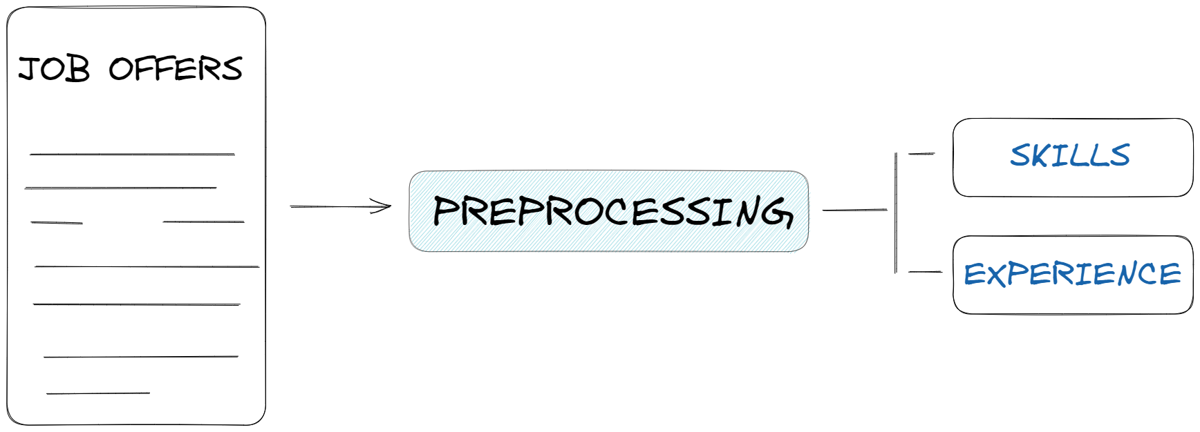
In this section, let's deal with preparing the data for Explorative Data Analysis (EDA):
- job experience: let's create a separate column (
experience) in thedfdataset where we specify the required experience level for each offer, - skills: let's create a separate dataset
skills_dfwhere we include the counted number of appearances of skills in the offerings.
Job experience
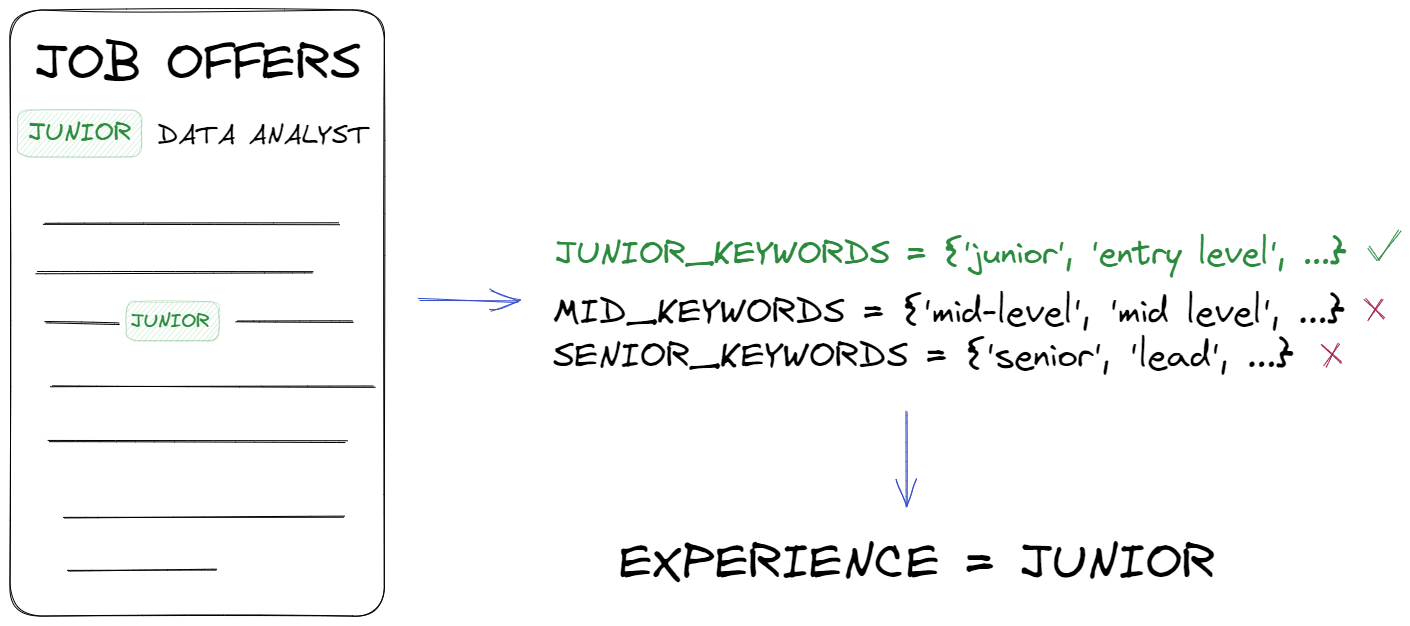
In this step, our goal is to collect information on the level of experience required for the position, the only problem we will encounter is that each offer is written in a different way. The level that is needed can be described in different words. In order to generalize the data and extract information from it, we create a set of keywords for each job grade.
# keywords to detect seniority level

junior_keywords = {'junior', 'entry level', 'intern', 'apprentice','jr','I'}

mid_keywords = {'mid-level', 'mid level', 'midlevel','mid', 'II',
    'consultant', 'intermediate', 'experienced','associate','practitioner'}

senior_keywords = {'senior', 'lead', 'principal', 'sr', 'III', 'IV',
    'senior level', 'advanced','senior associate', 'expert'}
After creating a set of keywords, we can run them through a simple function that iterates through each announcement, and if it finds a keyword from the set, it assigns it to one of the three classes (Junior, Mid, Senior). Of course, it could be that it will find nothing - in that case, it assigns unknown class. After checking all the job offers, it creates a new column called experience.
# function to assign an offer to a category
def categorize_job(row):
    title = row['title'].lower()
    description = row['description'].lower()
    for keyword in junior_keywords:
        if keyword in title or keyword in description:
            return 'Junior'
    for keyword in mid_keywords:
        if keyword in title or keyword in description:
            return 'Mid'
    for keyword in senior_keywords:
        if keyword in title or keyword in description:
            return 'Senior'
    return 'unknown'

# add column
df['experience'] = df.apply(categorize_job, axis=1)
Skills
In this case, to create a new dataset skills_df, we use the tokens available in the dataset from the ["description_tokens"] column and count them by for loop and add each token to the "skills" list using the extend function. After executing the loop, the "skills" list will contain all the skills appearing in the descriptions. Then, using the "np.unique" function, it will count how many unique skills there are and how many times each skill appears in the "skills" list.
# Counting skills appearing in the description and title
skills = []

for val in df.description_tokens.values:
    skills.extend(val)
skills, counts = np.unique(skills, return_counts=True)

# Create DataFrame with skills and number_of_postings columns
skills_df = pd.DataFrame({"skill": list(skills), "number_of_postings": counts})
Great, we have a new dataset, now let's just select those values that appear at least 10 times and sort them from the largest number.
# Select rows with number_of_postings >= 10
skills_df = skills_df[skills_df['number_of_postings'] >= 10]

# Sort by number_of_postings in descending order
skills_df = skills_df.sort_values(by=["number_of_postings"], ascending=False)
Our data frame looks like this.
skill   number_of_postings
==========================
sql           7743
excel         5292
tableau       4291
python        4189
powerbi       4111
...           ...
aspnet         14
dplyr          13
unixlinux      12
jquery         12
js             11
==========================
4. Create data analysis
Our data is ready to be presented, let's create charts. We will use the matplotlib library to create graphs.
plt.figure(figsize=(12,6))
plt.style.use('ggplot')

level = df['experience'].value_counts()
level.plot(kind='bar')

plt.title(" Number of jobs")
plt.ylabel("Counts")
plt.xticks(rotation=45)
plt.show()
The next three charts are done exactly the same way, just change the column name in the df[ ] to one of these three:
company_nameviaschedule_type
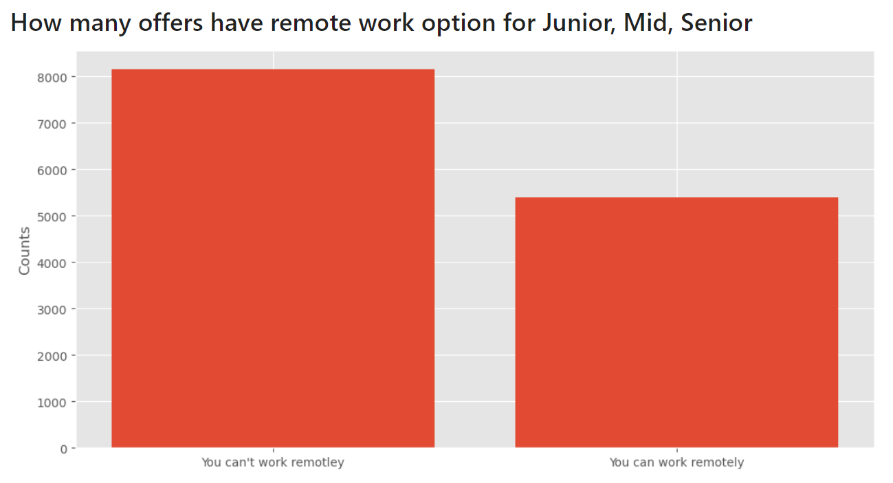
Remote work
To make a chart with remote work, I chose the get_dummies function from the pandas library. The pd.get_dummies() function creates new columns with the prefix 'remote' and binary values for each unique value from the 'work_from_home' column.
dummies = pd.get_dummies(df_lvl['work_from_home'], prefix='remote', prefix_sep='_')

plt.figure(figsize=(12,6))
counts = dummies.value_counts()
bar_name = ["You can't work remotley", 'You can work remotely']
plt.bar(bar_name, counts)
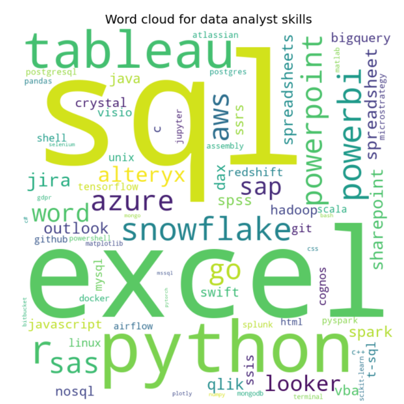
Word Cloud
We can use Word Cloud to make our presentation more interesting. This is a collection of all the sub-counted words, the size of the word depends on the number of times the word is repeated in the text. The Word Cloud just like the rest of the code, will be customized according to our choice made in the experience column.
# create a dictionary from the sorted_counts variable
word_dict = skills_df.set_index('skill')['number_of_postings'].to_dict()

# generate the word cloud
wordcloud = WordCloud(width = 800, height = 800,
                background_color ='white',
                min_font_size = 10).generate_from_frequencies(word_dict)
And make visualization for wordcloud with the matplotlib.
# Display the word cloud
plt.figure(figsize = (12, 6), facecolor = None)
plt.imshow(wordcloud)

plt.axis("off")
plt.tight_layout(pad = 0)
plt.title('Word cloud for data analyst skills')
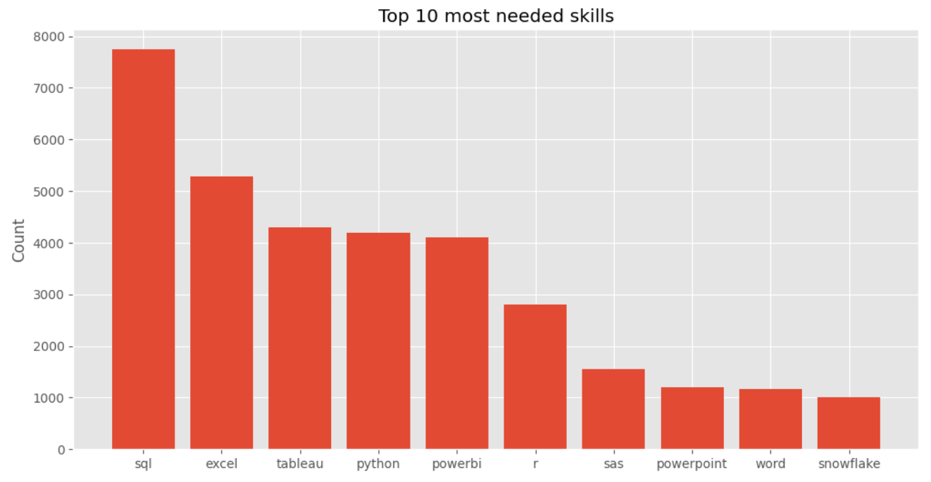
Top 10 required skills
The last chart we will prepare is the Top 10 required skills. We just need to select the first 10 rows from our skills_df and present them on the chart.
# extract the 10 most common keywords
top_skills_df = skills_df[:10]
plt.figure(figsize=(12,6))
plt.bar(top_skills_df['skill'], top_skills_df['number_of_postings'])

plt.title('Top 10 most needed skills')
plt.ylabel('Count')
All done! The preprocessing and data visualization code is ready. 🎉
5. Exploratory Data Analysis
We can finally move on to checking our charts and drawing conclusions.
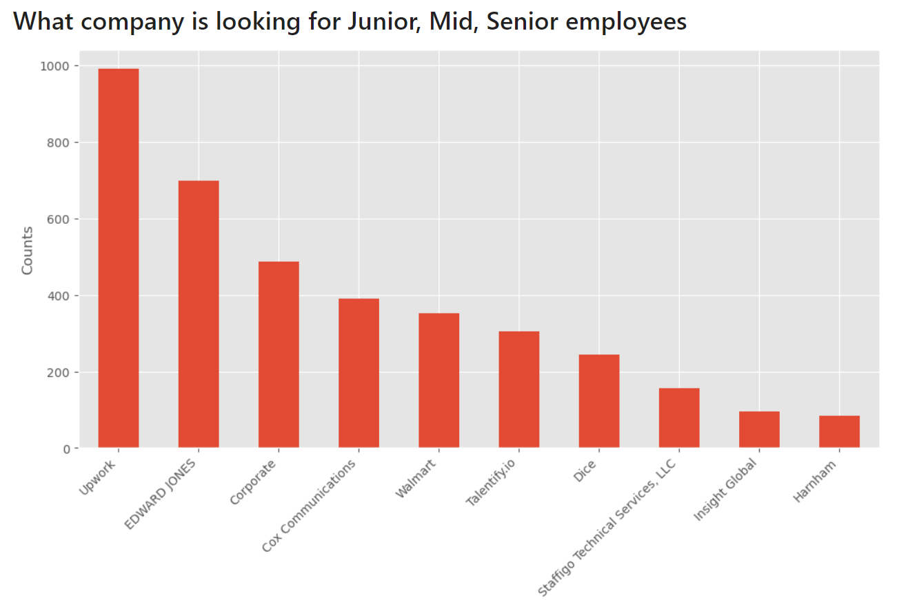
Who is looking for the largest number of Data Analysts?
The company Upwork with almost 1,000 job offers is dramatically breaking through. You can find there a freenlance contracts.
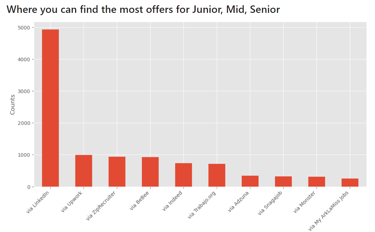
Where can you find the most job offers?
The Linkedin is positioned first, and right after that we see Upwork again.
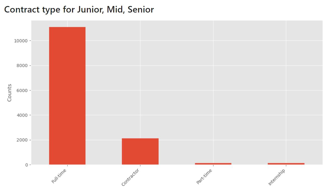
What are the types of contract?
Of course, the most companies need full-time Data Analysts.
And when it comes to the possibility of working remotely, there are more than 5,000 listings with this option.
What are the 10 most needed skills?
According to the chart, the most sought-after skills are SQL, Excel and Tableau.
6. Share your analysis as a web app
We've done a great job with creating a Python notebook. Why not share it with our colleagues as a web app? It can be easily done with Mercury framework. You can add interactive widgets to the notebook and deploying it with few clicks in the Mercury Cloud.
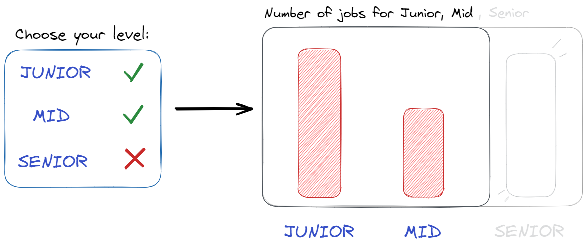
We can use interactive widgets to personalize data and charts to recipients depending on their job experience and abilities. For example, user can choose job experience level from the widget, and Mercury framework will recompute all charts in the notebook based on selection.
Interactive widgets
Let's use a MultiSelect widget to filter job experience in the DataFrame.
lvl = mr.MultiSelect(value=['Junior','Mid','Senior'],
                    choices=['Junior','Mid','Senior'], \
                    label="Choose your level")
valuedetermines what values will be assigned by default,choicesdetermines what all options we have.
Let's use widget selection to filter rows in our dataset df.
df_lvl = df[df['experience'].isin(lvl.value)]
In the case of our second dataset skills_df, the code will look as follows:
# skill selection widget
sk_set = mr.MultiSelect(value=['sql','tableau', 'python', 'r', ...],
                        choices=skills_df['skill'],
                        label="Choose your skills")

# filter skills
sk_df = skills_df[skills_df.skill.isin(sk_set.value)]
From now on, any chart we have made so far after changing df to df_lvl, or skills_df to sk_df will only create charts based on the selected choices.
Start web app
Please navigate in the terminal to the folder with the notebook. Please execute command mercury run to start a web app at 127.0.0.1:8000. Below is a screen video showing how to interact with web app:
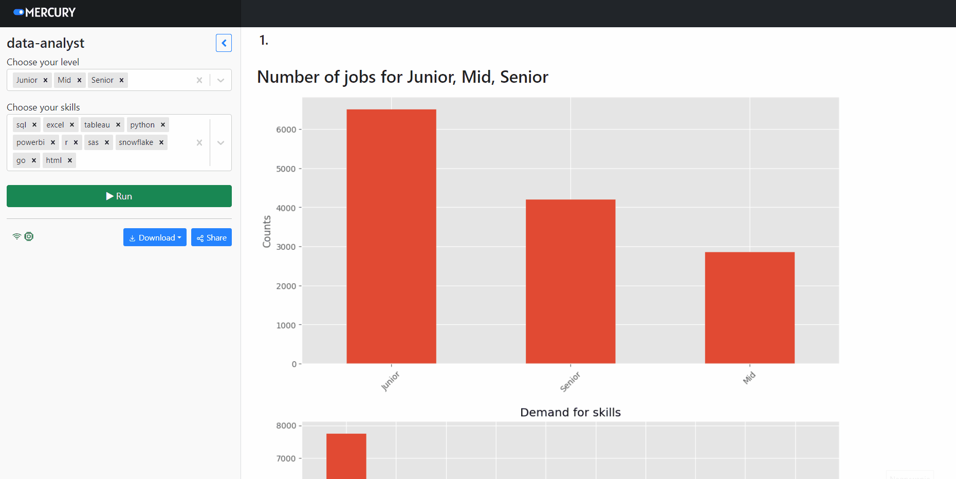
You can easily and for free deploy the notebook over the internet with the Mercury Cloud service. The notebook from this article is available online at use-cases.runmercury.com.
7. Summary
In this article, we learned how to extract information from job offers and went through the entire process of creating EDA. The most of job listings are on the Linkedin. The most significant demand is for Junior Data Analyst. It turns out that Data Analysts with knowledge of SQL, Excel, and Tableau are most in need. Do you agree? We also showed how everyone could interact with your notebook and how, without the frontend technologies knowledge, you can easily share your work, thanks to Mercury framework.
AI Data Analyst on Your Computer
Use MLJAR Studio to explore data, find insights, and create reports with AI. Everything runs locally, so your data stays with you.
Related Articles
- Save a Plot to a File in Matplotlib (using 14 formats)
- Convert Jupyter Notebook to Python script in 3 ways
- 3 ways to get Pandas DataFrame row count
- 9 ways to set colors in Matplotlib
- Jupyter Notebook in 4 flavors
- Fairness in Automated Machine Learning
- 3 ways to access credentials in Jupyter Notebook
- How to create Dashboard in Python from PostgreSQL
- How to create Invoice Generator in Python
- ChatGPT can talk with all my Python notebooks