4 ways for Exploratory Data Analysis in Python
Exploratory Data Analysis (EDA) is the first step in analyzing data, where you explore and understand your data before doing any complicated tasks or making predictions. It involves carefully looking at your data, checking for mistakes, and fixing any issues. You summarize the data using measures like averages and totals to get a better understanding of what your data contains. You also create visual representations, such as charts and graphs, to see patterns, trends, and unusual data points clearly. During this process, you ask questions about how different variables might be related or influence each other. The main purpose of exploratory data analysis is to get familiar with your data so you can make informed decisions or build reliable models.
Python is an excellent language for exploratory data analysis because it offers user-friendly tools that help you quickly understand and visualize your data. With libraries like Pandas, Matplotlib, and Seaborn, you can clean data, handle missing values, calculate summaries, and create charts to identify patterns or trends. Although manually performing exploratory data analysis can sometimes be challenging and time-consuming, especially with large or complex datasets, Python provides tools like Skrub, ydata-profiling, and Pygwalker, which automate data summarization, missing value detection, and chart creation, making the process faster and simpler. Additionally, using an AI assistant can further streamline and accelerate your data analysis, allowing you to focus more on interpreting results rather than writing complex code. Python's simplicity and ease-of-use make it a perfect choice for anyone beginning their journey in data exploration.
In this article, I will show you how to do exploratory data analysis using Python tools like Skrub, ydata-profiling, Pygwalker, and AI assistant powered by OpenAI's ChatGPT. I will demonstrate these tools on the Adult census income dataset. These tools will help you spend less time on complicated coding and more time exploring and understanding your data.
You can download data from my Github repository with sample datasets or use below Python code, which reads CSV data directly from Github URL address.
import pandas as pd
# load example dataset
df = pd.read_csv("https://raw.githubusercontent.com/pplonski/datasets-for-start/master/adult/data.csv", skipinitialspace=True)
# display DataFrame shape
print(f"Loaded data shape {df.shape}")
# display first rows
df.head()
There are 32,561 rows and 15 columns in the dataset. The first 5 rows from DataFrame is displayed below:

1. Exploratory Data Analysis with Skrub
Skrub is a Python library designed to simplify the preparation of tabular data for machine learning tasks. It offers high-level tools for joining dataframes, encoding columns, building pipelines, and interactively exploring data. The source-code for package is available at github.com/skrub-data/skrub.
Please run the following command to install Skrub package:
pip install skrub
The code to create exploratory data analysis report:
# import skrub
from skrub import TableReport

# open skrub TableReport
TableReport(df)
When running in the Python notebook the report is displayed below code cell. In the first view, you will see a table showing first and last rows of the DataFrame. You can click on the selected column to see its distribution:

You can check detailed statistics computed for each column in the DataFrame by opening Stats tab. You will see if there are missing values in your data.

There are distribution plots available for every column. Please notice, that there are histograms for continuous data and most frequent values for categorical columns.
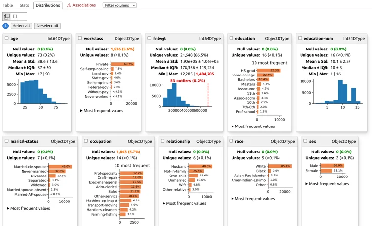
Personally, I like the Associations tab provided by Skrub because it lists pairs of columns based on the Cramér's V statistic. This statistic measures how strongly two categorical variables are related—the higher the value, the stronger the dependency between the columns. I've used this feature several times and discovered interesting relationships in my data that I wasn't previously aware of. It's become one of my favorite ways to quickly uncover hidden insights during exploratory data analysis.

2. EDA with ydata-profiling
YData-Profiling is a Python library that provides an extended analysis of a DataFrame, allowing the data analysis to be exported in different formats such as HTML and JSON. It offers a one-line Exploratory Data Analysis (EDA) experience, delivering a comprehensive analysis of datasets, including time-series and text data. Key features include type inference, univariate and multivariate analysis, time-series analysis, text analysis, file and image analysis, dataset comparison, and flexible output formats. The library also supports Spark, enabling scalability for large datasets. The source code is available at github.com/ydataai/ydata-profiling
The package can be added to Python environment with the following command:
pip install ydata-profiling
You can create EDA report and display it with Python code. The below code will create report.html file and display it in the iframe.
# import ydata profiling
from ydata_profiling import ProfileReport

# create report
profile = ProfileReport(df)

# save report as html
profile.to_file("report.html")

# display report in notebook
from IPython.display import IFrame
IFrame(src='test.html', width='100%', height='1000')
You will see a report, which is very similar to a website, displayed below code cell in Python notebook. The ydata-profiling will check missing values, duplicate rows and variable types:

You can select any column from the DataFrame and check it statistics and distribution. Please notice, that there is More details below the chart, you can click it to have even more information about each column.

The interactions plot visually shows how two variables affect each other, revealing patterns beyond simple correlation. It helps users clearly see complex or non-linear relationships, making exploratory data analysis easier and more insightful.

YData provides clear correlation matrices and heatmap visualizations that help users easily explore relationships between variables. It calculates correlations based on variable types: Spearman's coefficient for numeric-to-numeric pairs, Cramér's V for categorical pairs, and Cramér's V with automatic discretization for numeric-to-categorical pairs.

3. Visual EDA with Pygwalker
Pygwalker is a Python library that makes exploratory data analysis easy by turning your Pandas DataFrame into an interactive visual interface. It lets you quickly create insightful charts and dashboards through a simple drag-and-drop editor, without needing to write complex code. With Pygwalker, you can visually explore, filter, and analyze your data in real-time, making it easier to discover hidden patterns and trends. It's a great tool for anyone who wants fast and intuitive data exploration directly within a Jupyter notebook. The source code is available at github.com/Kanaries/pygwalker.
Installation step:
pip install pygwalker
Please open the report with the following code:
# import pygwalker
import pygwalker as pyg

# start Pygwalker
walker = pyg.walk(df, show_cloud_tool=False)
Pygwalker gives you a visual interface for easily creating charts and graphs. You can quickly make visualizations by dragging columns into specific fields, similar to Tableau. It helps you explore data interactively without writing complex code.

4. EDA with AI assistant
MLJAR Studio includes an AI assistant that helps you quickly perform exploratory data analysis and simplifies your workflow. With this assistant, you can automatically generate Python code, analyze datasets, and create insightful visualizations just by asking simple questions. The source code is available at github.com/mljar/studio.
In MLJAR Studio, there's a chat interface on the left side and a Python notebook on the right side. You can type questions or prompts directly to the AI assistant in the chat. The assistant will generate Python code based on your prompts, and if the code looks good, you can run it immediately in your notebook. This setup makes your exploratory data analysis quicker and easier, letting you spend less time coding and more time exploring your data.

Additionally, I have created a video, I'll show you how you can use an AI assistant in MLJAR Studio to speed up your data analysis workflow. You'll see how simple it is to ask the assistant questions about your dataset, generate Python code automatically, and run it directly in your notebook. By leveraging the AI assistant, you'll be able to focus more on understanding your data instead of writing complex code.

Summary
Exploratory Data Analysis (EDA) is essential for understanding your data and making informed decisions. Python is an ideal language for EDA, providing user-friendly tools like Skrub, ydata-profiling, Pygwalker, and AI assistants powered by ChatGPT. Skrub allows you to quickly explore data distributions and relationships interactively, highlighting hidden insights. Ydata-profiling generates detailed and comprehensive reports to deeply analyze variables and their relationships automatically. With Pygwalker, creating interactive visualizations is as simple as dragging and dropping columns into a visual editor. AI assistants, such as the one included in MLJAR Studio, simplify the process further by automatically generating Python code and insightful visualizations from your prompts. Using these tools lets you spend less time coding and more time uncovering valuable insights from your data.
Explore next
Continue with practical guides, tutorials, and product workflows for Python, AutoML, and local AI data analysis.
- AI Data Analyst
Analyze local data with conversational AI support and notebook-based, reproducible Python workflows.
- AutoLab Experiments
Run autonomous ML experiments, track iterations, and inspect results in transparent notebook outputs.
- MLJAR AutoML
Learn how to train, compare, and explain tabular machine learning models with open-source automation.
- Machine learning tutorials
Step-by-step guides for beginners and practitioners working with Python, AutoML, and data workflows.
Run AI for Machine Learning — Fully Local
MLJAR Studio is a private AI Python notebook for data analysis and machine learning. Generate code with AI, run experiments locally, and keep full control over your workflow.
About the Author

Related Articles
- Jupyter Package Manager
- AutoML Open Source Framework with Python API and GUI
- Variable Inspector for JupyterLab
- Use ChatGPT in Jupyter Notebook for Data Analysis in Python
- ChatGPT for Advanced Data Analysis in Python notebook
- AutoML Example Projects: A Guide with 10 Popular Datasets
- What is AI Data Analyst?
- Navy SEALs, Performance vs Trust, and AI
- New version of Mercury (3.0.0) - a framework for sharing discoveries
- Zbuduj lokalnego czata AI w Pythonie - Mercury + Bielik LLM krok po kroku