6 best packages for data visualization in Python
Quick answer: The best Python data visualization package depends on your use case. This guide compares top libraries for analysis, dashboards, and publication-ready charts.
There are plenty of Python libraries for data visualization and people often don't know which one to choose. It's important to understand that Python doesn't have one - perfect for everything - package. Every single one of them has some pros and cons. In this article, I will introduce a few most popular Python packages for visualizing your data. Enjoy reading :)
List of included packages:
Matplotlib
Matplotlib is a popular Python library for creating static, interactive, and animated visualizations. It supports a wide range of plots, from simple line and bar charts to complex 3D visualizations, making it essential for data analysis and scientific computing. Its pyplot interface simplifies plotting with a MATLAB-like syntax, while the object-oriented API allows for advanced customization.
Matplotlib integrates well with libraries like NumPy and Pandas, and it supports exporting plots in multiple formats like PNG, PDF, and SVG. It also offers interactive features, subplots, and tools for animations and 3D plots, making it a versatile tool for data scientists and analysts.
It works perfectly in Python scripts and Python notebooks.
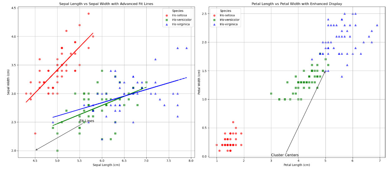 Data source: https://github.com/pplonski/datasets-for-start/blob/master/iris/data.csv
| Pros | Cons |
|---|---|
| ✅ Highly Customizable | ❌ Steep Learning Curve |
| ✅ Wide Range of Plots | ❌ Verbose Syntax |
| ✅ Integration with Libraries | ❌ Limited Interactivity |
| ✅ Quality Outputs | ❌ Slow with Large Datasets |
| ✅ Good Documentation | ❌ Basic 3D Support |
Seaborn
Seaborn is a powerful Python library built on top of Matplotlib that simplifies the creation of attractive and informative statistical graphics. It offers a high-level interface for creating a variety of plots, such as bar charts, heatmaps, and regression plots, with just a few lines of code. Seaborn is particularly well-suited for visualizing complex datasets and statistical relationships, providing built-in themes, color palettes, and easy integration with Pandas DataFrames.
With its focus on statistical data visualization, Seaborn makes it easier to create visually appealing plots that highlight trends, distributions, and relationships in data. While it simplifies many tasks, Seaborn retains the flexibility to customize plots, and can be used alongside Matplotlib for more advanced customizations.
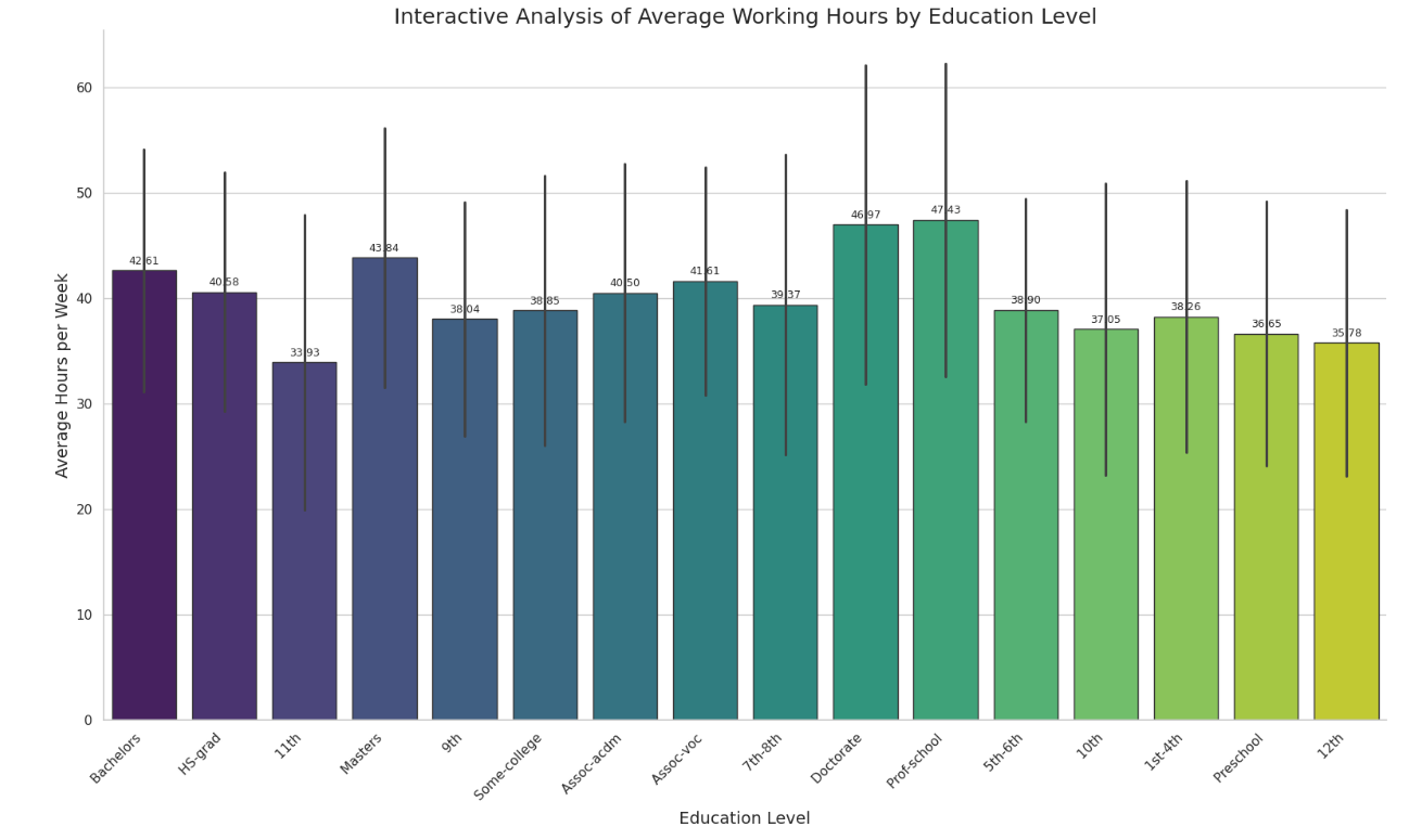 Data source: https://github.com/pplonski/datasets-for-start/blob/master/adult/data.csv
| Pros | Cons |
|---|---|
| ✅ Easy to use with minimal code | ❌ Less customizable than Matplotlib |
| ✅ Produces attractive, polished visuals. | ❌ Limited range of plot types |
| ✅ Integrates seamlessly with Pandas. | ❌ Slower with very large datasets |
| ✅ Great for statistical plots like heatmaps and regression plots. |
PyGWalker
PyGWalker is an interactive data exploration tool for Python, designed to simplify visual analysis in Jupyter Notebooks. It integrates seamlessly with Pandas DataFrames, allowing users to quickly create various visualizations like scatter plots, bar charts, and histograms using a point-and-click interface. PyGWalker offers real-time updates and interactive filtering, making it an ideal tool for quick data exploration. With its intuitive GUI, users can easily drag and drop columns to generate insights without writing extensive code. It’s a great choice for data analysts looking for an easy-to-use and efficient way to explore their data visually.
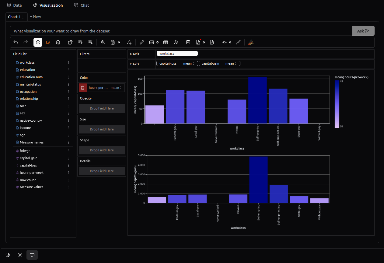 Data source: https://github.com/pplonski/datasets-for-start/blob/master/adult/data.csv
| Pros | Cons |
|---|---|
| ✅ Easy interactive data exploration. | ❌ Not suitable for production use. |
| ✅ Seamless integration with Pandas. | ❌ Limited customization options. |
| ✅ Real-time visualization updates. | ❌ Best used in Jupyter Notebooks. |
| ✅ User-friendly with no coding required. | ❌ Lacks advanced chart features. |
| ✅ Ideal for quick insights in Jupyter Notebooks. |
Plotly
Plotly is a Python library for creating interactive and visually engaging visualizations. It supports a wide variety of chart types, including line charts, scatter plots, bar charts, maps, and 3D plots, making it versatile for different data visualization needs. Unlike static libraries, Plotly focuses on interactivity, allowing users to zoom, pan, hover, and explore data dynamically.
Plotly's visualizations are web-based, outputting as HTML files that can be easily shared or embedded in web applications. It also integrates seamlessly with Dash, a framework for building interactive dashboards. With its extensive customization options and advanced features, Plotly is an excellent choice for creating modern, shareable, and interactive visualizations.
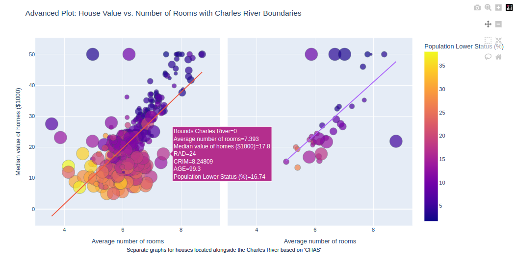 Data source: https://github.com/pplonski/datasets-for-start/blob/master/housing/data.csv
| Pros | Cons |
|---|---|
| ✅ Interactive plots by default. | ❌ Advanced customizations can be complex. |
| ✅ Supports basic and advanced charts, including 3D and maps. | ❌ Slower with large datasets. |
| ✅ Easy to share as web-based HTML files. | ❌ Larger library size than simpler tools. |
| ✅ Integrates well with Dash for dashboards. | ❌ Steeper learning curve for beginners. |
| ✅ Highly customizable. |
Altair
Altair is a declarative Python library for creating interactive and visually appealing data visualizations. Built on the Vega-Lite framework, it allows users to define plots with a simple, intuitive syntax by mapping data columns to visual elements like position, color, and size. Altair works seamlessly with Pandas DataFrames, making it easy to explore and present data.
Altair emphasizes simplicity and automation, automatically optimizing scales, legends, and axes for clean visuals. It also supports interactivity, such as zooming and filtering, without requiring extensive coding. Ideal for medium-sized datasets, Altair is a great choice for creating elegant, interactive visualizations quickly and efficiently.
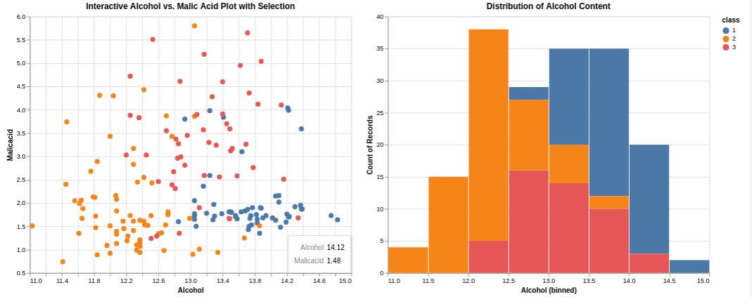 Data source: https://github.com/pplonski/datasets-for-start/blob/master/wine/data.csv
| Pros | Cons |
|---|---|
| ✅ Simple and intuitive syntax. | ❌ Limited customization options. |
| ✅ Built-in interactivity (zoom, filter). | ❌ Not ideal for large datasets. |
| ✅ Automatically creates clean visuals. | ❌ Requires Vega-Lite setup. |
| ✅ Easy integration with Pandas. | ❌ Fewer plot types compared to other libraries. |
| ✅ Efficient for medium-sized datasets. |
Folium
Folium is a Python library for creating interactive maps, built on the Leaflet.js framework. It allows users to overlay geographical data, such as markers, polygons, and choropleths, onto maps. Folium maps are interactive, enabling users to zoom, pan, and explore the data. The library integrates easily with Pandas for visualizing geospatial data and exports maps as HTML files, making them simple to share or embed in web applications. With its easy-to-use syntax and customization options, Folium is an excellent choice for visualizing and sharing geographic data.
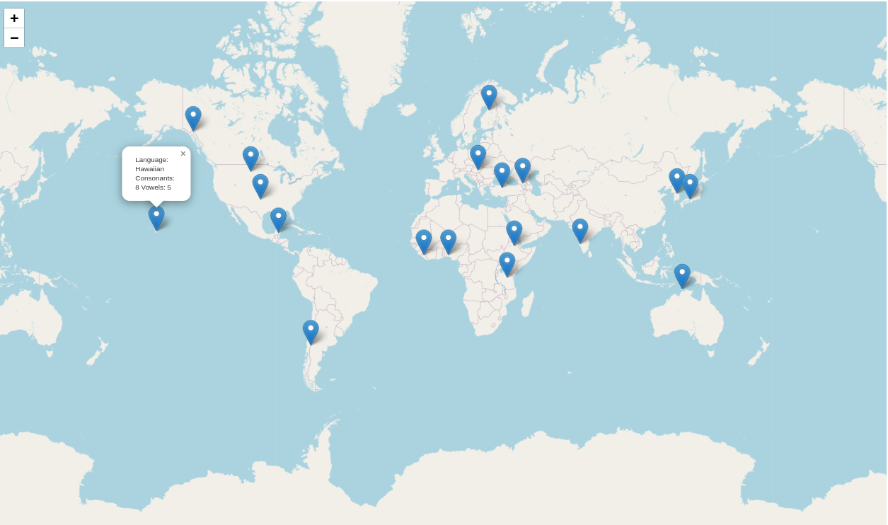 Data source:
https://github.com/python-visualization/folium-example-data/blob/main/consonants_vowels.csv
| Pros | Cons |
|---|---|
| ✅ Interactive maps with zoom and pan. | ❌ Limited to geospatial visualizations. |
| ✅ Easy geospatial data visualization. | ❌ Slower with large datasets. |
| ✅ Simple syntax and customization. | ❌ Limited advanced customizations. |
| ✅ Integrates with Pandas. | |
| ✅ Exports maps as shareable HTML. |
Summary
It's crucial to note that I compared only a few of the most popular Python packages for data visualization in the hope of helping you choose the best tool for your needs.
Here’s a brief summary for you:
- Matplotlib s a powerful, highly customizable library for creating a wide range of static and interactive plots, but it has a steep learning curve and limited interactivity.
- Seaborn simplifies statistical plotting with beautiful visuals and integration with Pandas, though it’s less customizable and slower with large datasets.
- PyGWalker provides an intuitive, interactive data exploration interface, ideal for quick insights in Jupyter Notebooks, but lacks customization options and is not suitable for production use.
- Plotly excels at interactive, web-based visualizations and supports advanced charts like 3D and maps, but it has a steeper learning curve and can be slow with large datasets.
- Altair offers a simple, declarative syntax for creating interactive visualizations, making it ideal for medium-sized datasets, but it has limited customization and fewer plot types.
- Folium - specializes in interactive map visualizations, great for geospatial data, but limited to mapping and can be slow with large datasets.
Each library has its strengths and weaknesses, making them suitable for different use cases based on the complexity of the data, the required interactivity, and the desired level of customization.
All of the example plots are created using MLJAR Studio.
Get more information about our tool for Data Scientists here: https://mljar.com/
Explore next
Continue with practical guides, tutorials, and product workflows for Python, AutoML, and local AI data analysis.
- AI Data Analyst
Analyze local data with conversational AI support and notebook-based, reproducible Python workflows.
- AutoLab Experiments
Run autonomous ML experiments, track iterations, and inspect results in transparent notebook outputs.
- MLJAR AutoML
Learn how to train, compare, and explain tabular machine learning models with open-source automation.
- Machine learning tutorials
Step-by-step guides for beginners and practitioners working with Python, AutoML, and data workflows.
Run AI for Machine Learning — Fully Local
MLJAR Studio is a private AI Python notebook for data analysis and machine learning. Generate code with AI, run experiments locally, and keep full control over your workflow.
About the Author
Related Articles
- 4 Effective Ways to Visualize LightGBM Trees
- 4 Effective Ways to Visualize Random Forest
- 4 Effective Ways to Visualize XGBoost Trees
- Is weather correlated with cryptocurrency price?
- How to become a Data Scientist?
- How to install packages in Python
- The future of no code data science
- Programming Languages for Data Science
- 8 Open-Source AutoML Frameworks: How to Choose the Right One
- LightGBM predict on Pandas DataFrame - Column Order Matters
